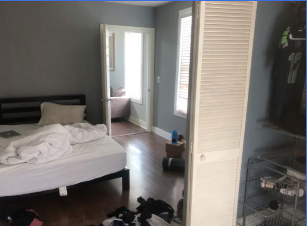
I had the amazing opportunity to partner with BlindsDotCom for a dream bedroom makeover giveaway! We chose our lucky winner in June and I got to get to work planning a retreat for the entrant, Lizette’s, brother who she chose to surprise with the makeover… Um Sister of the year! Here is a before of her brothers space.
Here is a current picture of their space!
I got the opportunity to have a FaceTime chat with Lizette who walked me through her brother’s space and afterwards we chatted and she expressed his needs for the room. Needs listed below-
- Noise canceling elements like rugs, art, and a wall feature (they’re comfortable taking on DIY)
- Room darkening window treatments because the sun comes in strong in the morning
- A place to sit and read
The room is quite compact and has some obstacles so I knew it would be a challenge, but one I was up for. First challenge is the room is broken into two parts, the closet space and the sleeping space. There are two entry points, which dictates furniture placement and scale. Then finally the bedroom is off of the living room and he complained that it was a bit noisy. He asked for help minimizing that noise.
With the budget I had available to me there was not a ton I can do to help the noise; that would require some construction and insulation. BUT I hope that with the addition of elements like a wall feature, rugs, curtains and art it can help reduce the volume by absorbing some of that unwanted sound, versus being an echo chamber.
My design process is simple. I chat with the client and do a walk through of the space with them (in this case a virtual walkthrough). We take measurements and find out the clients needs. Next we determine the clients style. The easiest way to do this is by having them create a mood board via Pinterest filled with all of the bedroom spaces they love. If the mood board is disjointed with no clear direction I help them fine tune it. Lucky for me, Dany’s mood board had a very clear vision and helping him focus or define his style was not a hurdle. He knows what he likes and it is GOOD. See two of his inspo photos below.
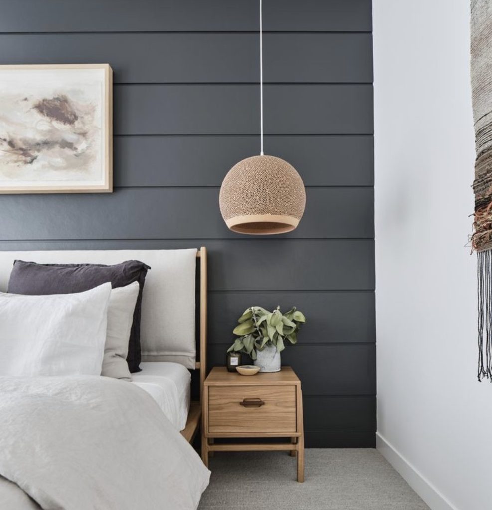
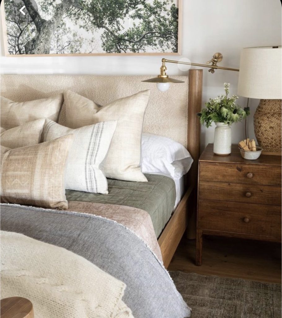
Now I needed to recreate a version of this for Dany on a $2000 budget. That may seem like a large amount but it truly doesn’t stretch as far as you’d think. That said I believe I came up with a solid plan and I utilized every single penny! I actually went over budget by $300… but gave the client a priority purchase sheet so they can implement the necessary items first and “bonus element” (an accent chair) to the design when/if their own personal budget allows.
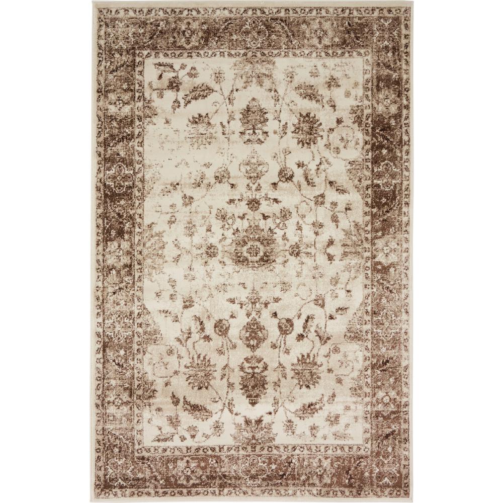
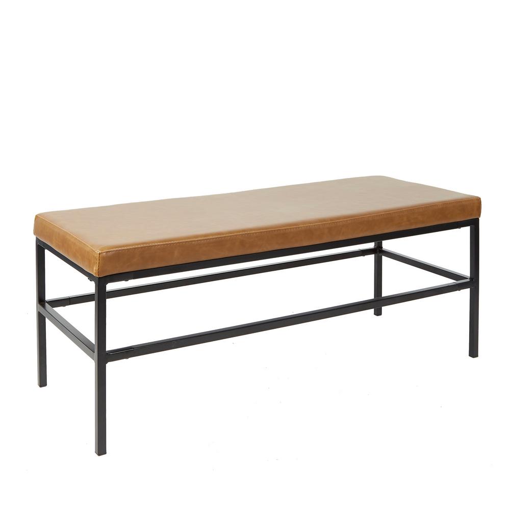
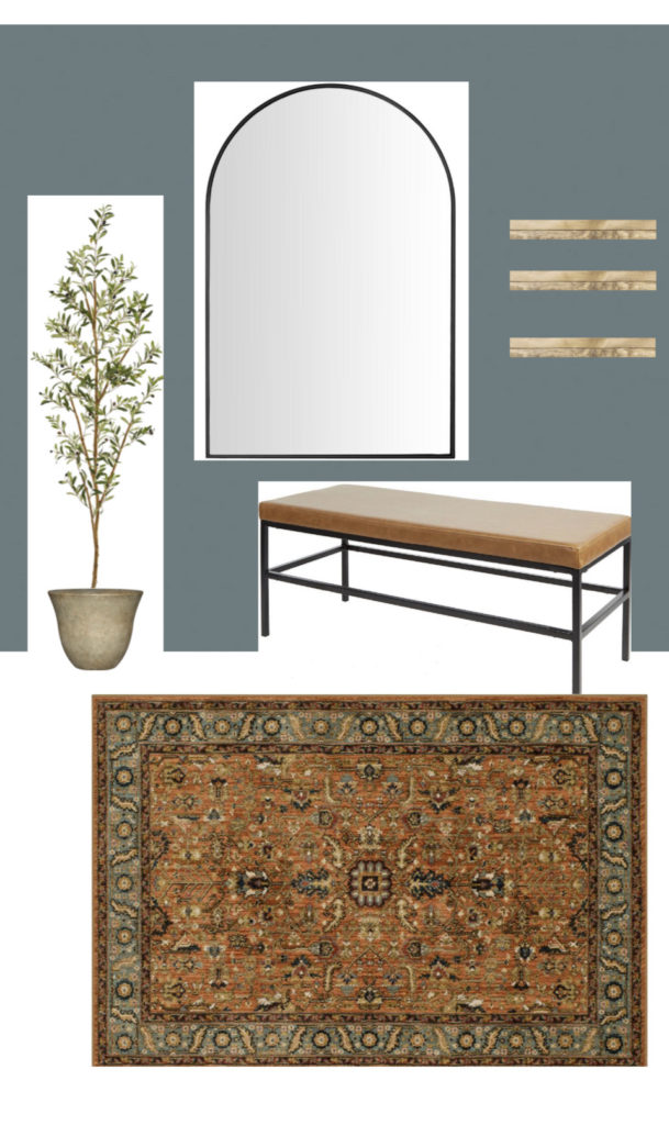
The first space I focused on was the closet nook. I took this, somewhat awkward, space as an opportunity to instead be a real “moment”. I suggested to the home owner that they paint the entire nook in, De Nimes by Farrow & Ball.. and I mean the entire nook- closet doors, baseboards, walls (not ceiling). Make it a moody little jewel box. Then utilize the wall opposite the closet (which is the angle shown in the mood board image below) as his dressing area. I added a large mirror, bench to sit and put on shoes, a faux tree to bring in some “life” a runner to ground and define the space and also suggested they add some DIY shelves by themselves later, for him to use for plants, pictures or even his day to day items like chapstick and a comb. The runner is the star in my opinion, playing on the warm tones in the cognac vegan leather bench and pairing perfectly with the moody walls. I dressed the windows in Woven Wood Cordless Shades by Blindsdotcom, combined with blackout drapes in their Somerset Alabaster (window coverings not seen in first mood board, shown in the third mood board).
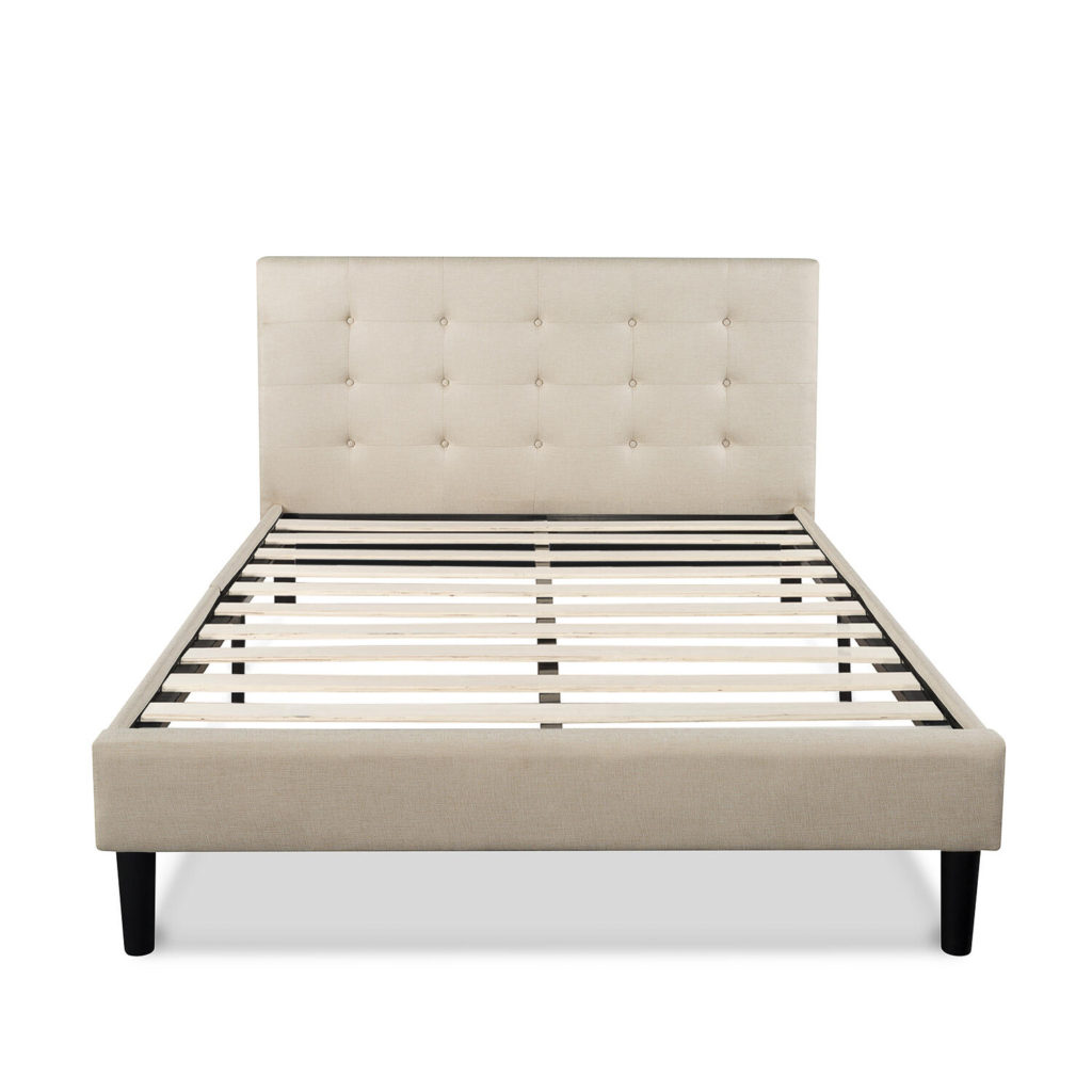
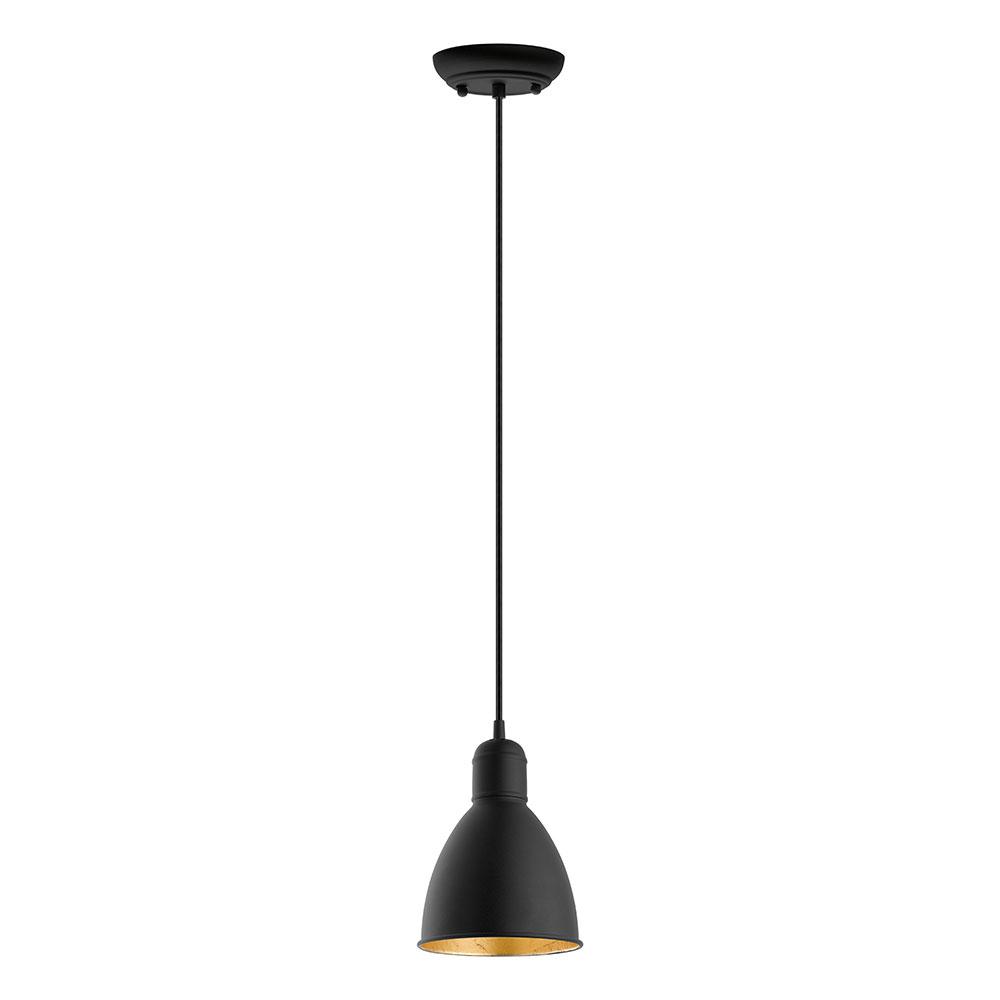
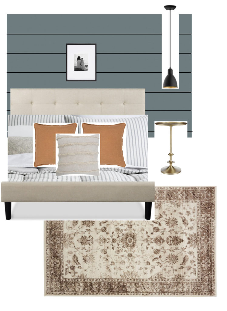
The next focal wall is home to his headboard. It is a very very narrow wall just large enough for a full bed and no room for a proper nightstand. That is why I chose this petite pedestal table paired with a hanging pendant to give him a space to set a water glass or book. This wall is also done in De Nimes but I have suggested they shiplap it. This shiplap gives them an opportunity to add an insulating element to this wall which is the one shared with the living room. I dressed the bed in neutral tones with a pop of color in a burnt orange to bring out the earthy tones from the gold table, rugs, cognac bench and woven shades. A simple black frame above the bed to compliment the black pendant play nicely against all the moody jewel tones. The rug in this space is more neutral and calming than the one in the closet nook, while still pairing nicely together.
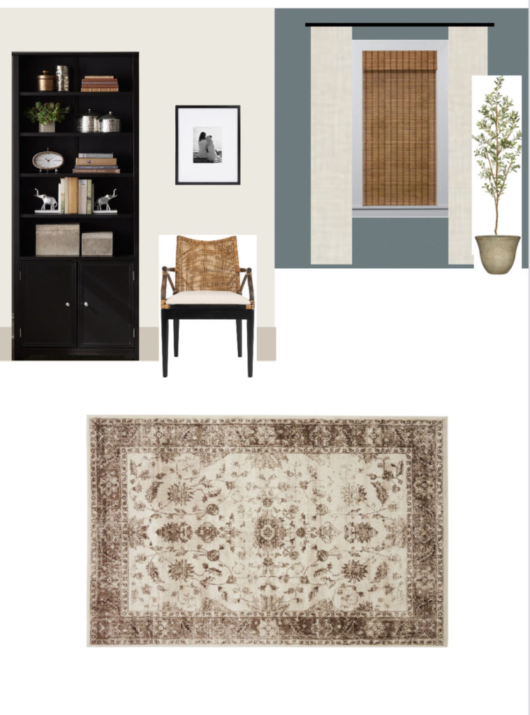
The final zone is the view when you enter the space from the living room door. You’ll notice it is painted in a creamy white with contrast trim (the blue portion seen is the inset closet nook). I am suggesting to the client they paint only the shiplap feature wall in the bedroom zone, as well as the closet nook in De Nimes. Then suggesting they paint the remaining 3 walls Alabaster with Accessible Beige contrast trim. This will keep the overall space from feeling small, it will define the bookcase and chair as one zone, the closet as another zone and the bed as yet another zone. In a small room, one that leaves you few options for furniture configuration, it’s fun to play with color and texture to help define the spaces. *You can see the BlindsDotCom window treatment selection I have chosen and suggest be used on both windows in, Dany’s room.
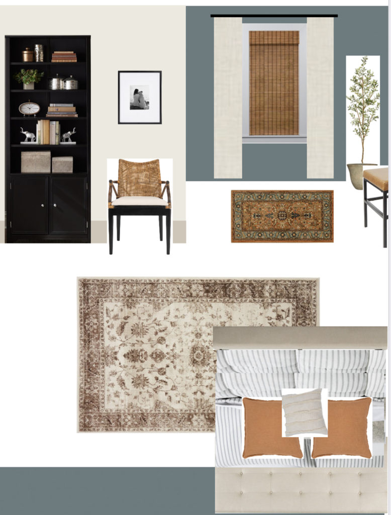
These aren’t obviously are not 3D renderings but they’re a basic mock up of how the space plan should flow. All that is left now is for Dany and his sister, Lizette to take the money and the design and have some fun with it. I hope they share the “after” with us some day!
I can’t believe this dream bedroom makeover with BlindsDotCom has really come to an end. It was such a fun experience! I am super happy with how the space turned out and most importantly, Dany loves it and so does his amazing sister who nominated him, Lizette. Truly grateful BlindsDotCom included me in this fun opportunity and I hope we will get to do it again for someone else one day!
SHOP MY PICKS


