


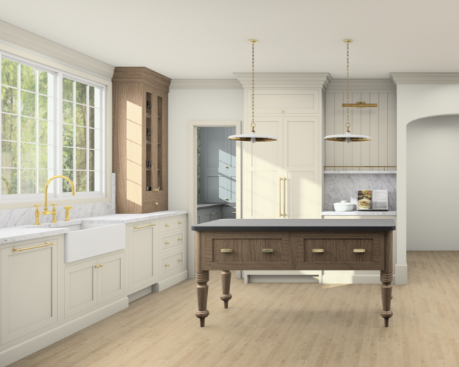
We received our kitchen renderings and space plan this past week! Seeing my crude sketches come to life in this way is beyond thrilling. I’ll share the renderings throughout the post below and chat about why I made certain design decisions, as well as provide the measurements for our specific space at the very end.
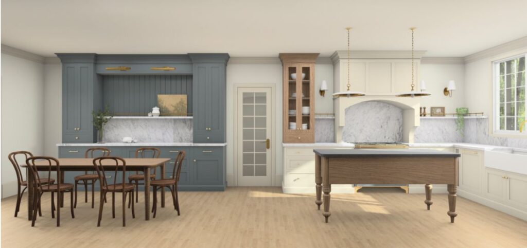
First things first, There are certain elements that will change. That door will not be a French pane rather solid and less busy. There will be runners and rugs to soften the space, the cabinetry may end up being more taupe than cream and the dining table and chairs will likely be different (shown is a representation of dining set we currently have). However, the overall look is pretty close to spot on. I know for some- because y’all made sure to tell me on Instagram, that the mix of wood, blue, cream and stone feels like “too much”. For me however the visual interest is crucial. This kitchen lives in a 114 year old home, the kitchen is a complete gut and remodel. Making this room feel like it belongs here, with quirky elements, texture and color- is how we are creating character and making it feel intentional and not “brand new”.
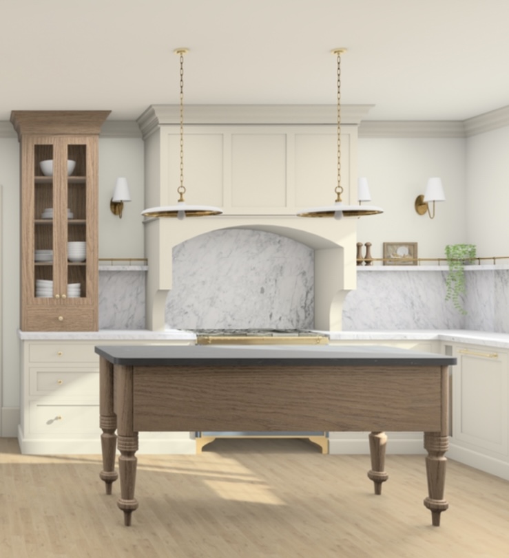
The kitchen designs I am most drawn to are ones in English country homes, think DeVol Kitchens. They seem to be pieced together in the most interesting and intentional way. The quirks make them special. Having our cabinetry all match or be too uniform felt “too new”; and while this kitchen is new, it’s going in a very old home and needs to feel welcome here. That is also why I went with a piece of furniture for the island versus cabinetry. Even though this meant I had forgo the option for electricity and plumbing in the island; it just felt like the right call for the home!
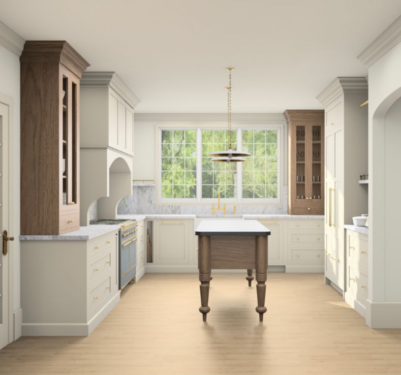
The Kitchen also underwent a semi-reconfiguration of layout. We removed a wall that separated the kitchen from dining and created a fully open space. Which left us with the decision, use both spaces as one massive kitchen or make the dining feel independent, but connected and cohesive. We opted for independent but cohesive. Again a massive kitchen in a 114 year old home felt wrong, but the open flow still allowed for us to extend the kitchen footprint slightly, makes it feel larger and more roomy, without removing the charm of the formal dining space. Note: the view below will look a bit different (millwork, mantel color, sconces, chandelier, furniture etc. will be added/changed).
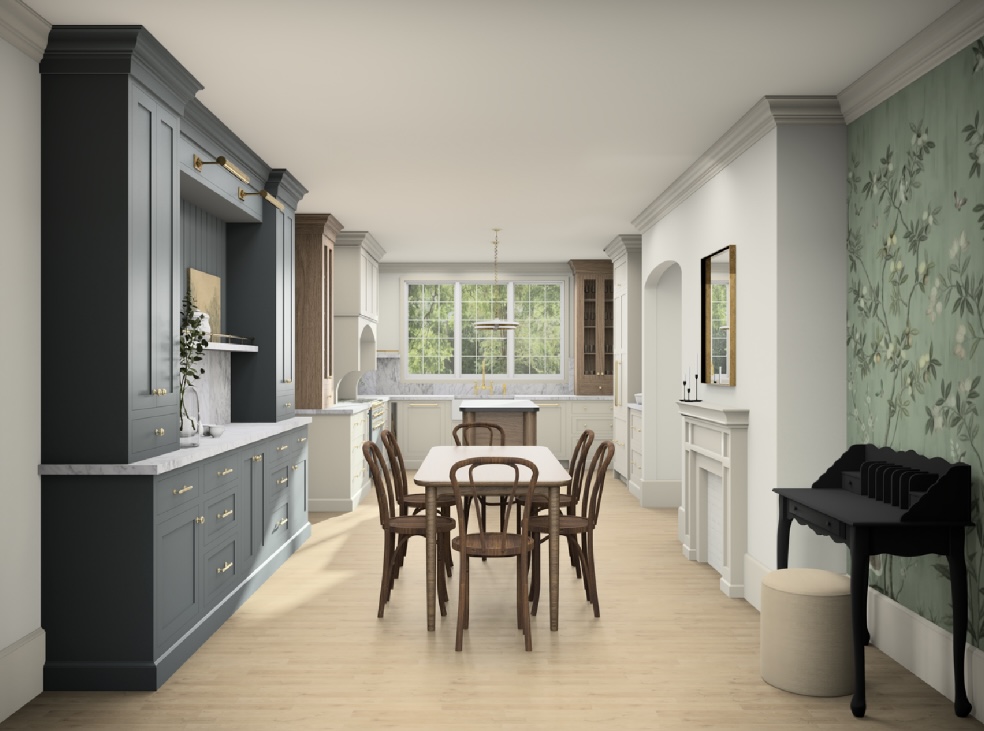
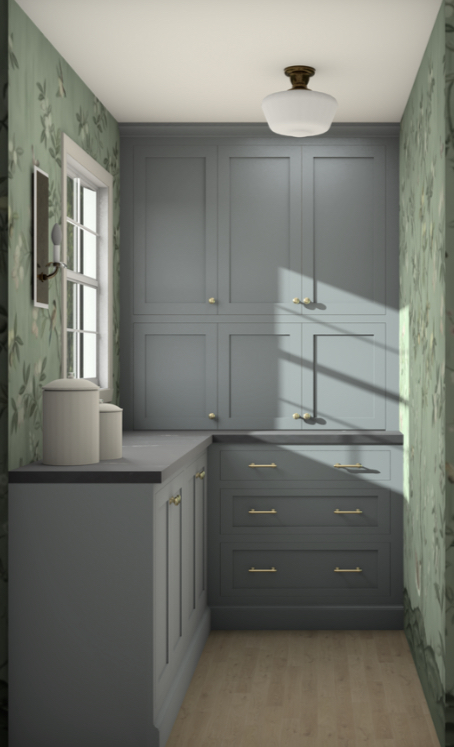
The way we kept the dining room “independent” was making the cabinetry in there the same style and similar dimension to the kitchen cabinetry, BUT used a different color and so it feels more like a piece of furniture. It also “floats” on the wall and doesn’t go corner to corner, like in the kitchen, which helps with the separate but connected feeling. We will bring that dining cabinet color back into play on the pantry cabinets which you can see a peek of beside the refrigerator wall which I LOVE. This little moment helps keep the color story cohesive and ties the space together.
Peek into the pantry itself below
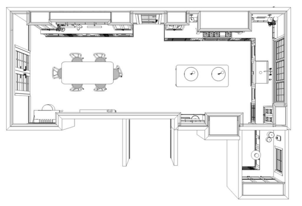
Last but not least our kitchen dimensions. We have been asked a lot what is the overall space measurement is; see caption of arial image below for those.
These kitchen renderings and space plan have been wildly helpful in helping finalize decisions with color, floor-plan. I cannot say enough good things about having them and our experience creating them with Unique Kitchen and Baths! This is not sponsored in any way but have been so happy with the process and wanted to share the resource we utilized for renderings.
