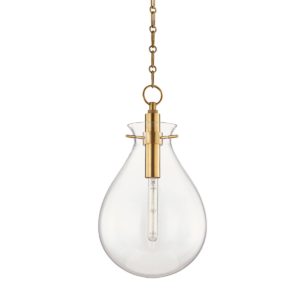
I’m so excited to share our dining room makeover before and after with you guys. If you follow on Instagram you have seen this makeover already but for those who don’t know, we recently took on a dining room refresh and are thrilled with the results. To see my inspiration for this space tap HERE. This makeover had a $500 dollar budget but fortunately for us we had an INCREDIBLE pendant from Hudson Valley Lighting designed by Becki Owens in storage. This pendant was intended for a different space in our home but ended up being the absolute perfect crown jewel to our dining room and made for an even better before and after!
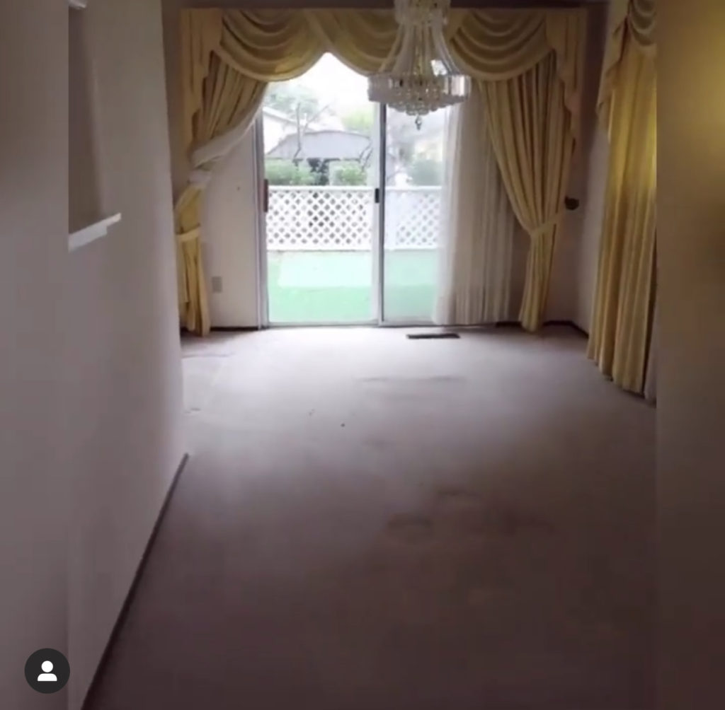
Before I get too far ahead of myself let me share some “before” pictures of the space. I am sharing both what the room looked like before we made our most recent edits and what it looked like when we bought the home three years ago.
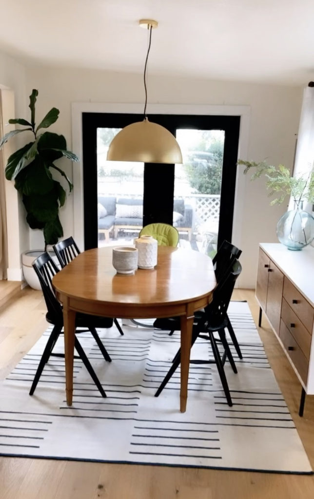
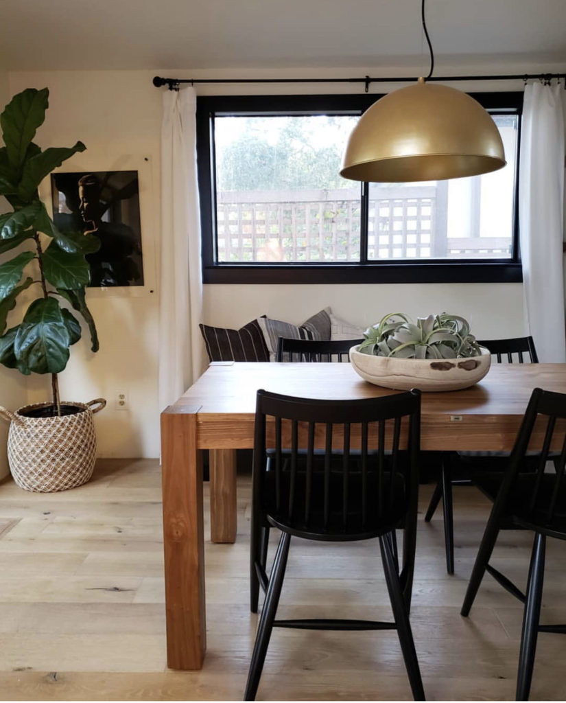
Now that we have seen before let’s check out the after.
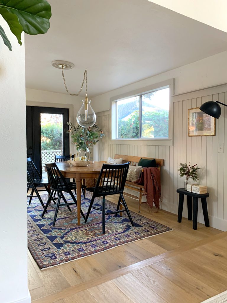
the most of the space!
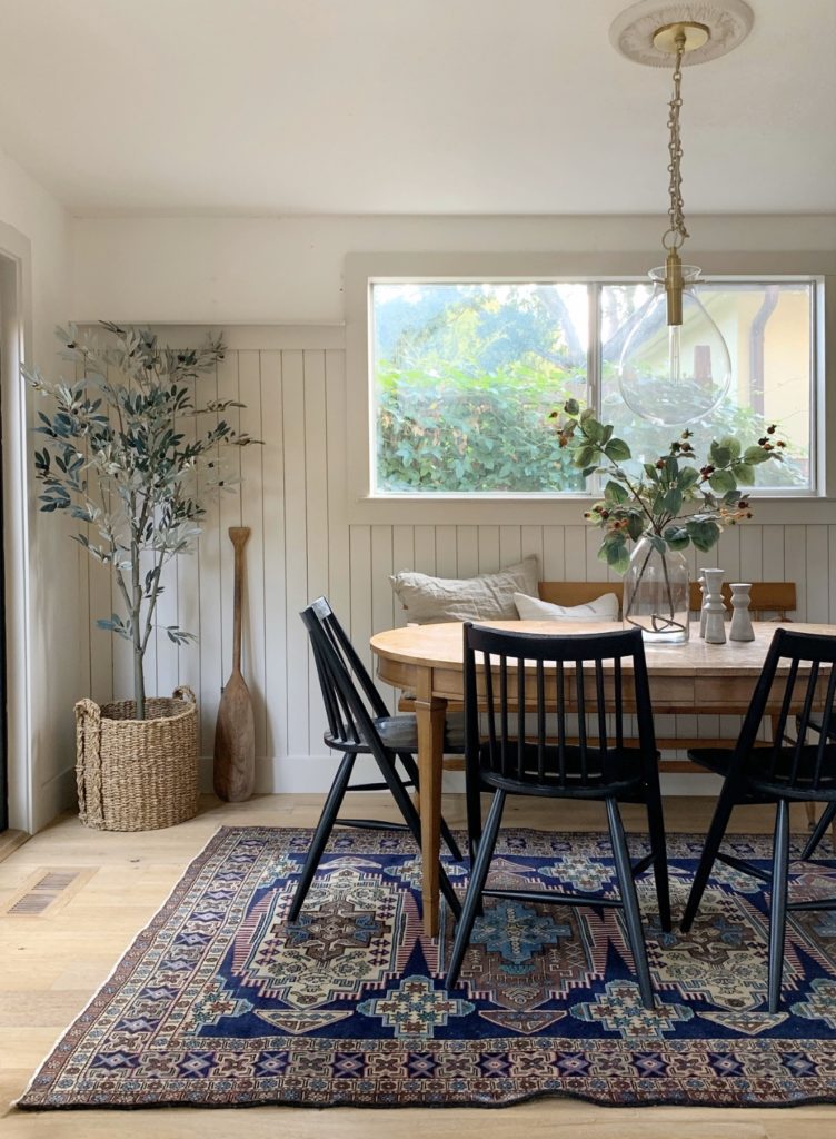
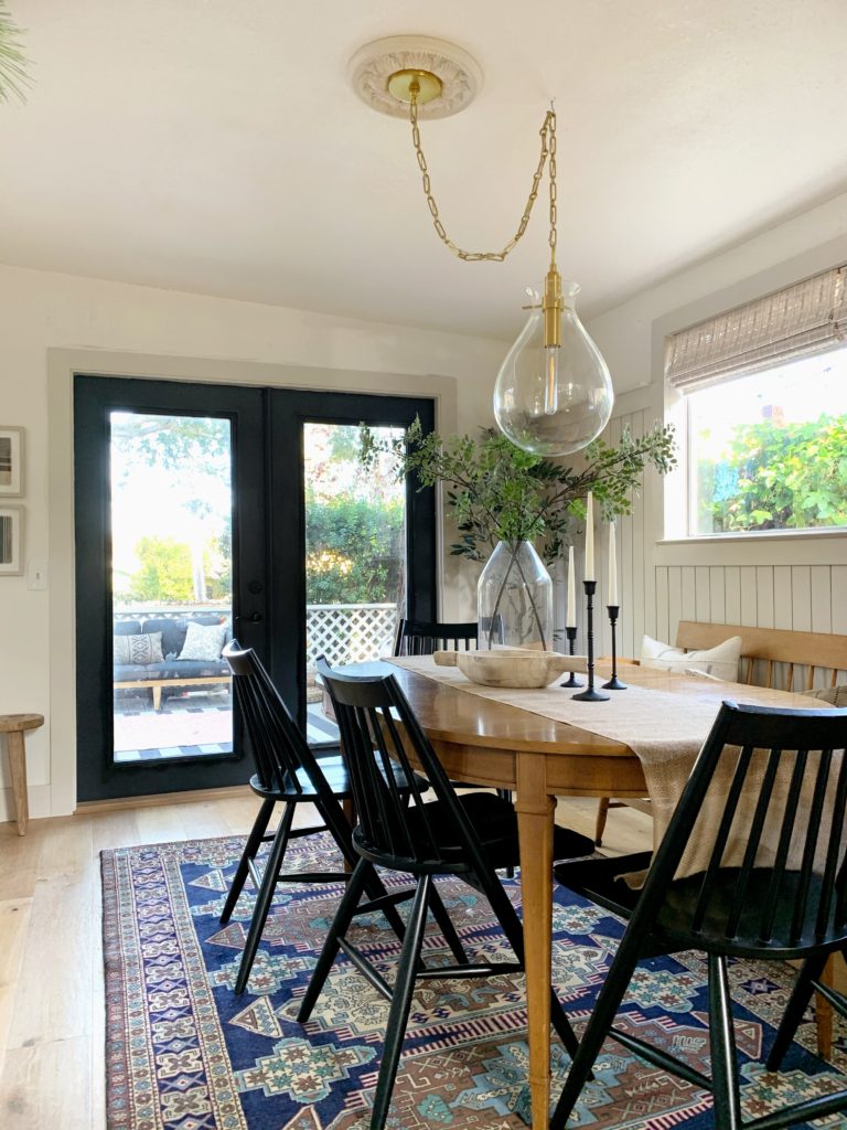
Love the gold chain detail of this pendant.
I am absolutely IN LOVE with the before and after transformation of our dining room. I have had a few people call it “farmhouse style” and said they prefer the minimal vibe of the before space. The actual design style is not farmhouse, rather it is- “Cozy, Transitional, Eclectic’. Which is a marriage of traditional, modern, comfortable and collected. That was the direction I took in the kitchen, and the kitchen feels like home- like us. That is why I moved in that same design direction for this space. It feels like us. You can expect to see me slowly transition more of that Cozy Transitional Eclectic style throughout a lot of our spaces in our home in the coming days.
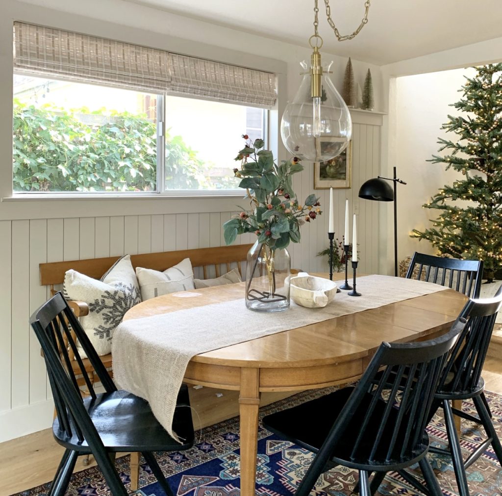
in this newly refreshed space.
The lighting from Hudson Valley Lighting is truly the most stunning element (beyond my husbands incredible wood wall detail of course). The light is big and it’s bold and it is a statement piece without being visually heavy. Impact without the weight is exactly what this little space needed. Every design decision counts in a small room. They all need to make the space function well and still look amazing. This pendant, for me, is the perfect finishing touch for our dining room.
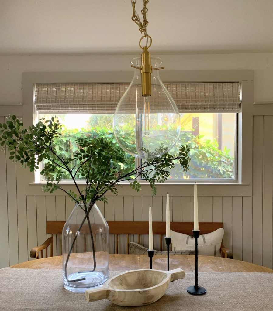
While most of the elements in this room are vintage, thrifted, DIY or found on Craigslist so i cannot link them- you can shop the pendant HERE.
*this post contains sponsored content*
