Oh snap!! It’s happening. The time has finally come for the Spring round of the Calling It Home, One Room Challenge… and I am participating. First timer over here!!! For those who don’t know what the One Room Challenge is, it is a six week design challenge for bloggers to complete the design of a single space in real time. Documenting the madness, that is voluntarily signing up for this chaos, as it unfolds.
*Pointing and laughing not appreciated, but understood.
 Lawd puh-leeze help me through this! And please let my husband still love me in six weeks, amen.
Okay, so when I realized this blog of mine would be done in time for the ORC, I thought long and hard about participation in said challenge. Should I do it? Am I crazy? What if I suck? Can I handle that stress? No, Erin! Don’t do this, it’s nuts!… and yet, here we are. Week one and I’m doing this; because “it’ll be fun”, they said, and “you’ll do great”, they said. Well they better be right! Hashtag peer pressure.
Anyway, while deciding to participate was a tough call, choosing which room to revamp was not. That choice was easy! I knew immediately I wanted to do the family room. The family room is our most used space. That is probably why once we finished renovations we just filled it with all of the leftover furniture to get it livable. It has never been truly designed and it’s Bippity, Blah-bity, Bleh-ness gets under my skin every day that I’m in it… which is everyday.
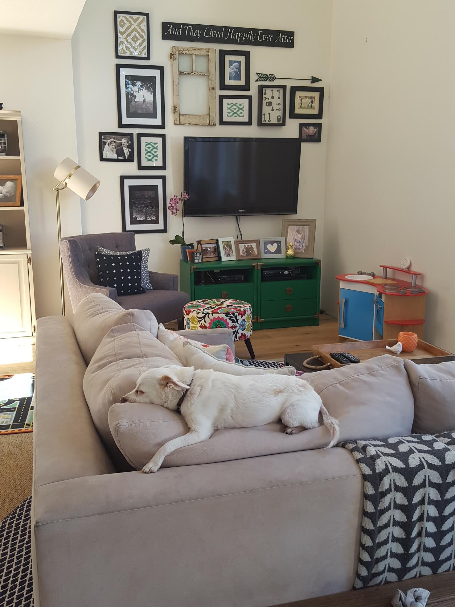
Look, it’s even boring the dog!
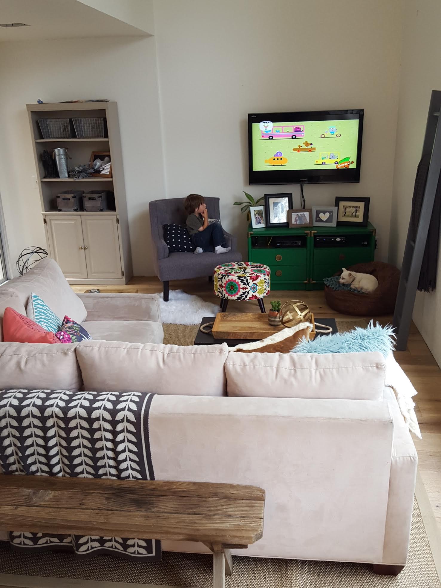
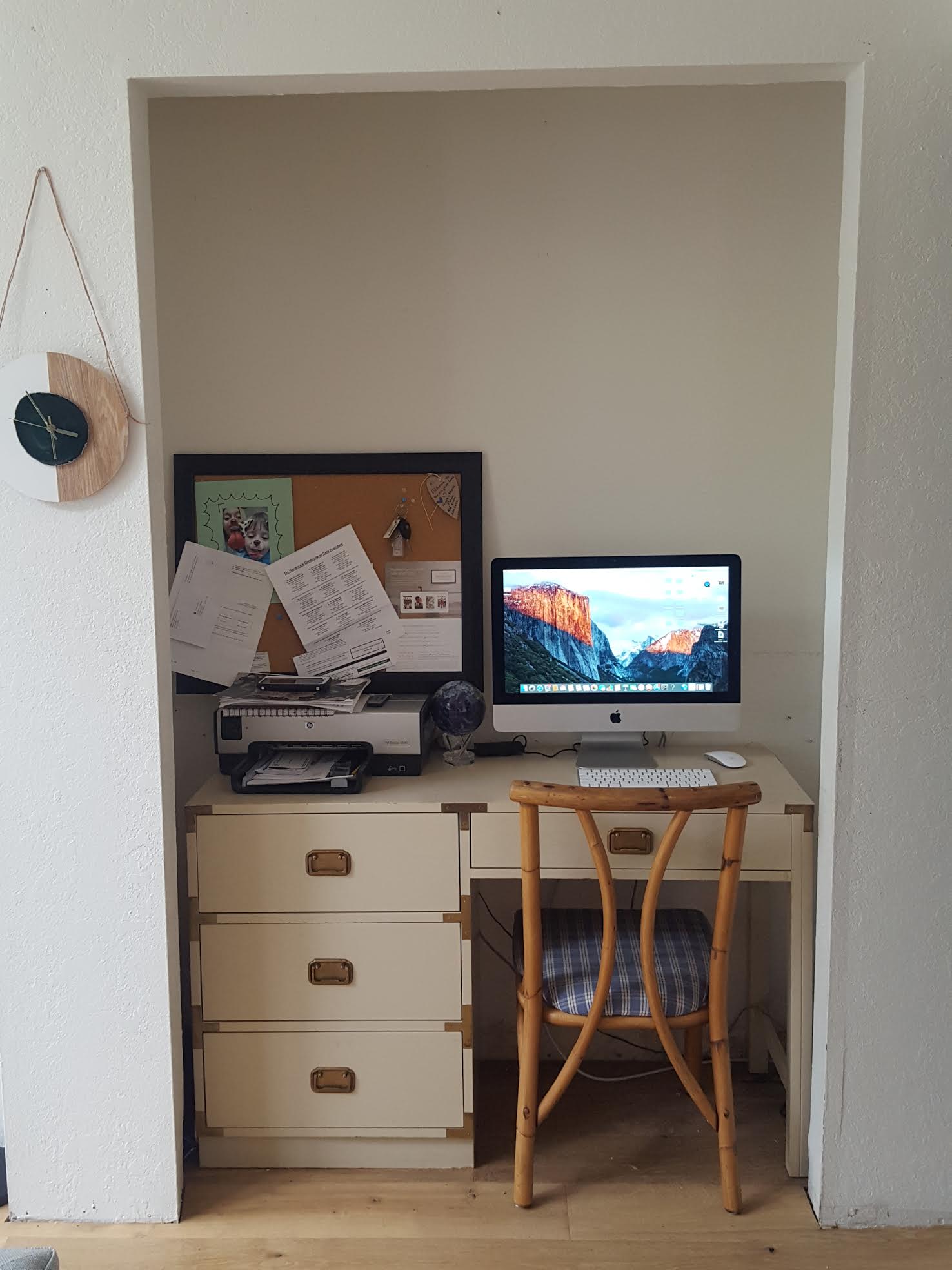
Now you see!? Do you see what I mean!? It’s a hodgepodge space. Everything we had from our old rental, thrown into one melting pot of a room. You do that for dinner and call it, stew. You do it with a family room and call it, well, kinda ugly!
But lets take a look back and some true ugliness. Which is the way it looked when we bought the ol’girl… because yikes.
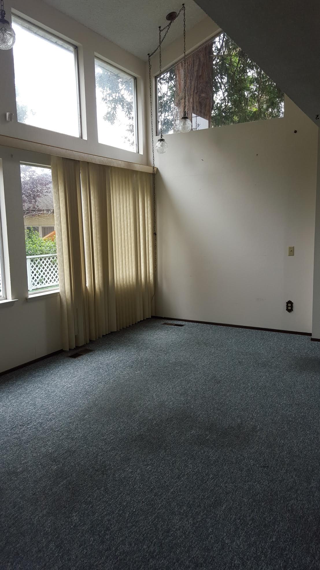
Look at those carpet stains. Oooh LaLa.
…and that wet bar! Hello 1970’s, “I’m Ron Burgundy”?
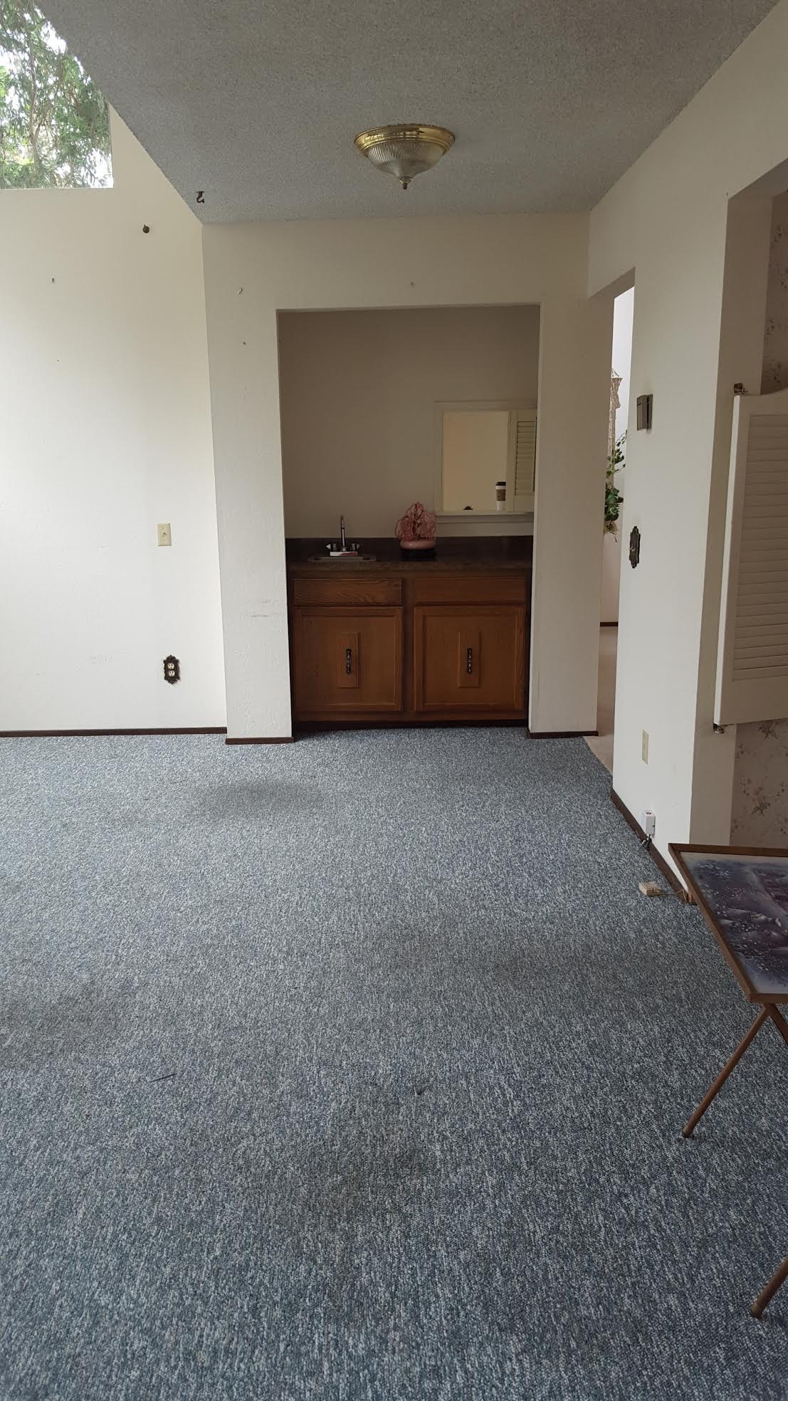
Step one was accepting it was ugly.
Step two was seeing the room had massive potential.
We knew one important key to unlocking that potential was in opening the wall to the dining room… wait, strike that, I knew this! My husband did not want to do it, and tackled the task of opening the wall under protest. In retrospect I think he just wanted to avoid the headache of more construction; which I get. But at the end of the day I was totally right, dont’cha just love when that happens.
Note: the hubs now agrees taking down the wall was the right call. Because, duh!
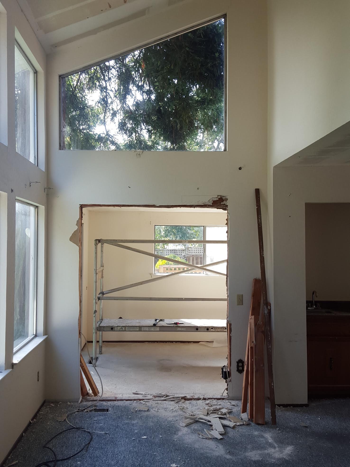
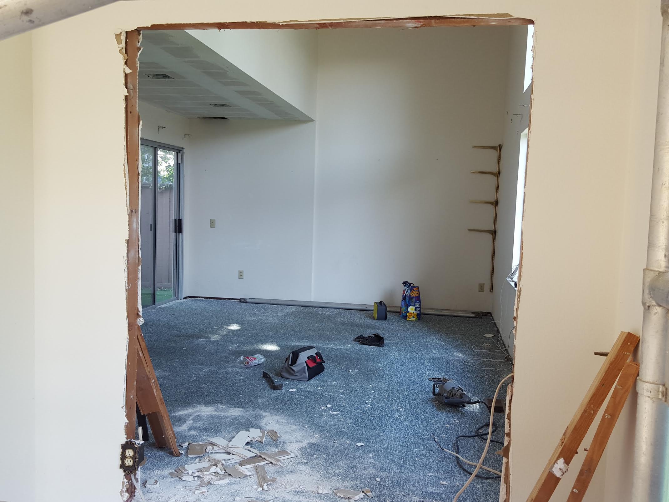
Then of course, aside from opening the wall, there was the obvious changes which needed to happen. Like removing the vertical blinds and taking down the popcorn ceilings. Pulling the wet bar to make way for an office nook. Replacing the old sliding door and finally ripping up the blue classroom carpet, to replace it with hardwood (seen below).
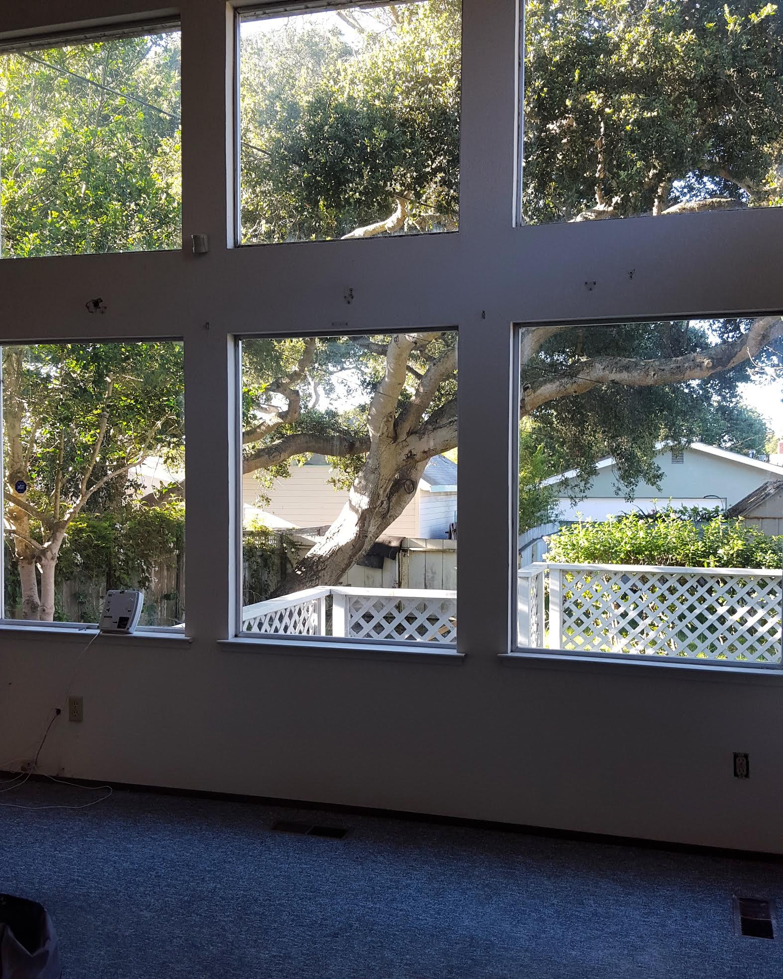


I can’t even talk about that astroturf outside guys… I can’t even!!
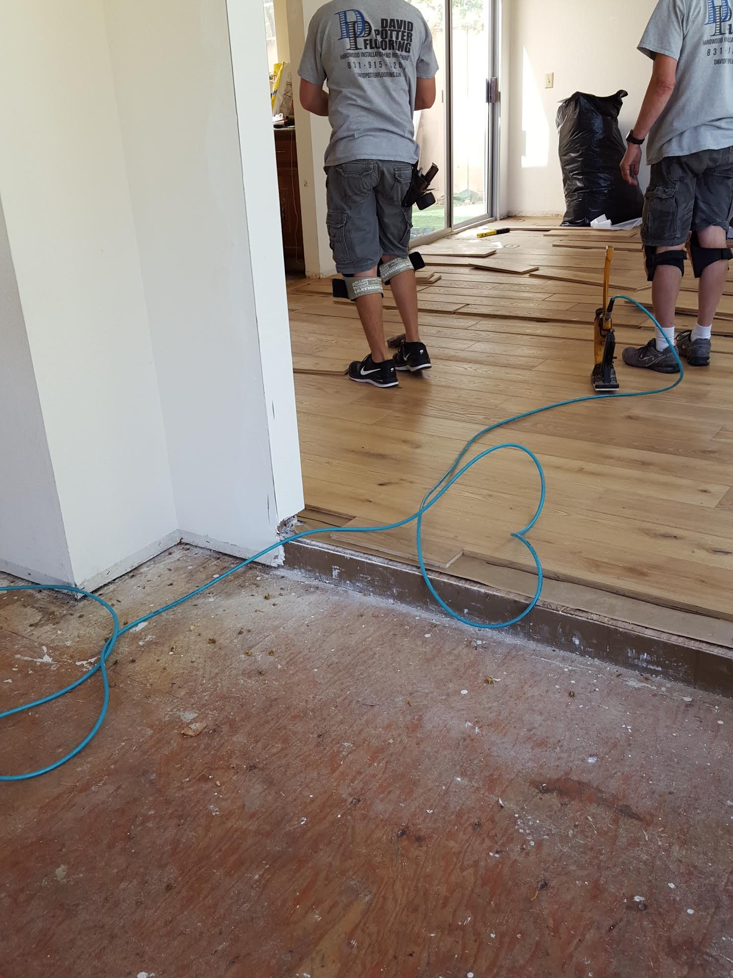
Once these renovations were done, it left us with a light filled wonderland, full of potential. Now the time has finally come to design it. Clouds part, angels sing!
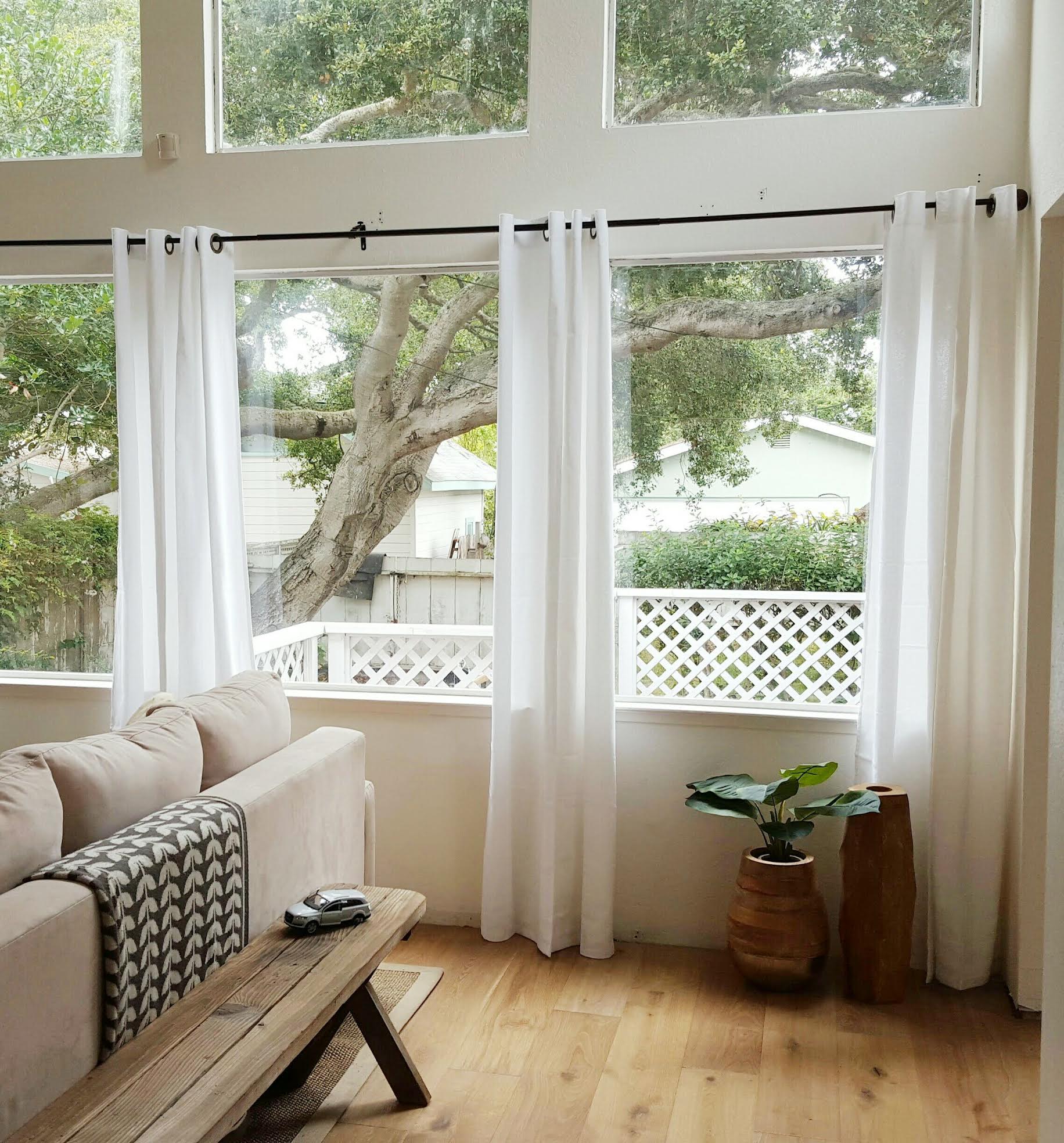
Now lets talk a little bit about the design plan. For me the design started with, and has since been centered around, the furniture. I fell madly in love with pieces by Article.I knew immediately their pieces would be the anchor for my entire design.
So when Article agreed to partner with me on this endeavor, I passed out. Then woke up, danced like a maniac, screamed and maybe cried a little. Which is a totally normal response to getting to work with your fave brand in my humble opinion!
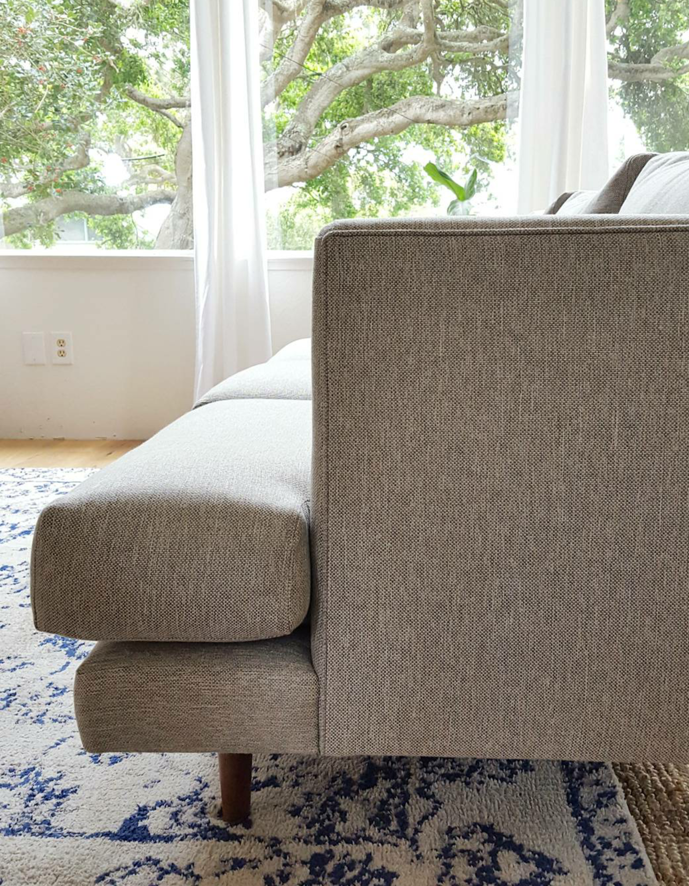
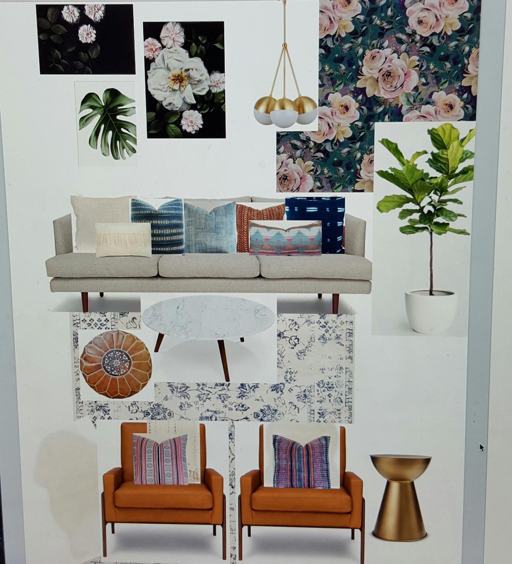
I will admit, the concept board seen below has been changed like 10 times… okay maybe 20. And truth be told the end result will likely have even more notable alterations. However the one thing that has never changed is my confidence in the decision to use the gorgeous Burrard sofa and Nord chairs from, Article and let me tell you why!
The perfect cool tone of the sea salt gray Burrard sofa, combined with its clean lines and low profile had me at hello. Bonus is that beyond it’s beauty it’s totally cozy! The down filled seats are firm enough to hold their gorgeous shape but sinkable enough to cuddle up on with my guys.
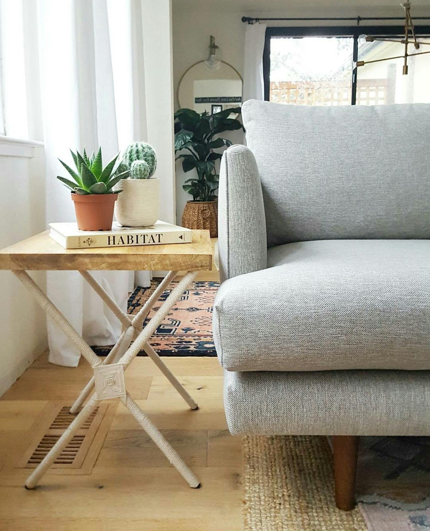
The charme tan leather Nord chairs with their mid mod design and nod to danish craftsmanship make them the effortlessly cool counterpart to our sleek sofa. And the leather, oh the leather, like budduh. I can’t say enough about how beautiful and soft it is. It’s clearly high quality full grain leather that will just get better with age, like the wine I drink while sinking into them… “Gertrude hold my calls”! (Gertrude is my imaginary receptionist and her resume reads, Name: Gertrude. Qualifications: pouring wine). Yes I know I’m weird, I’ve been told!
These sexy chairs are also deliciously comfy.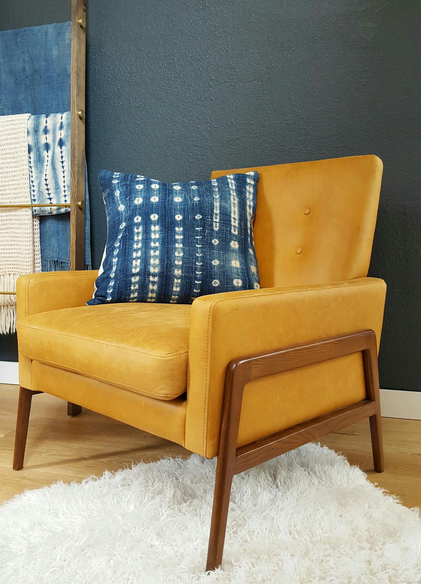
These gorgeous pieces from Article are the heart of this redesign and I couldn’t be happier about that! Now here is a peek at that concept board I mentioned earlier!
Now to execute! For a planner like me, that requires a list. So here it is…
6 Week To-Do List:
Shiplap install
Paint
Hang 2 story gallery wall
Wallpaper the office nook with paper by Milton & King
Tell my husband he’s greatest man alive
Hang floating shelves
Baseboard install
Paint some more
Crown molding install
Convince my husband not to leave me for putting us through this
Hang a barn door slider
Install overhead lighting by Lucent
More paint
Style it with my amazing Article goodies
Promise my husband never to put us through this again (with my fingers crossed behind my back)
Take a nap!
Here goes nothing!! I can’t wait to show you more as the design unfolds and room comes together. See you next week, eeeek! Oh and make sure to check out the Calling It Home, One room Challenge page to see loads more room transformations unfold!
Many of the products used for this makeover have been sponsored. All brands I reached out to myself and asked them to participate because I genuinely love their products. All opinions on their products and the quality of said products are mine own.
Wish Me Luck!!