**This Post Contain Sponsored Content**
Okay friends if you follow along on Instagram you know we just did a full kitchen remodel. I am finally sharing the before and after pics with you, plus sourcing all of the goodies from the makeover! But before we start let’s take that walk down memory lane I promised and see what before looked like. Im sorry in advance…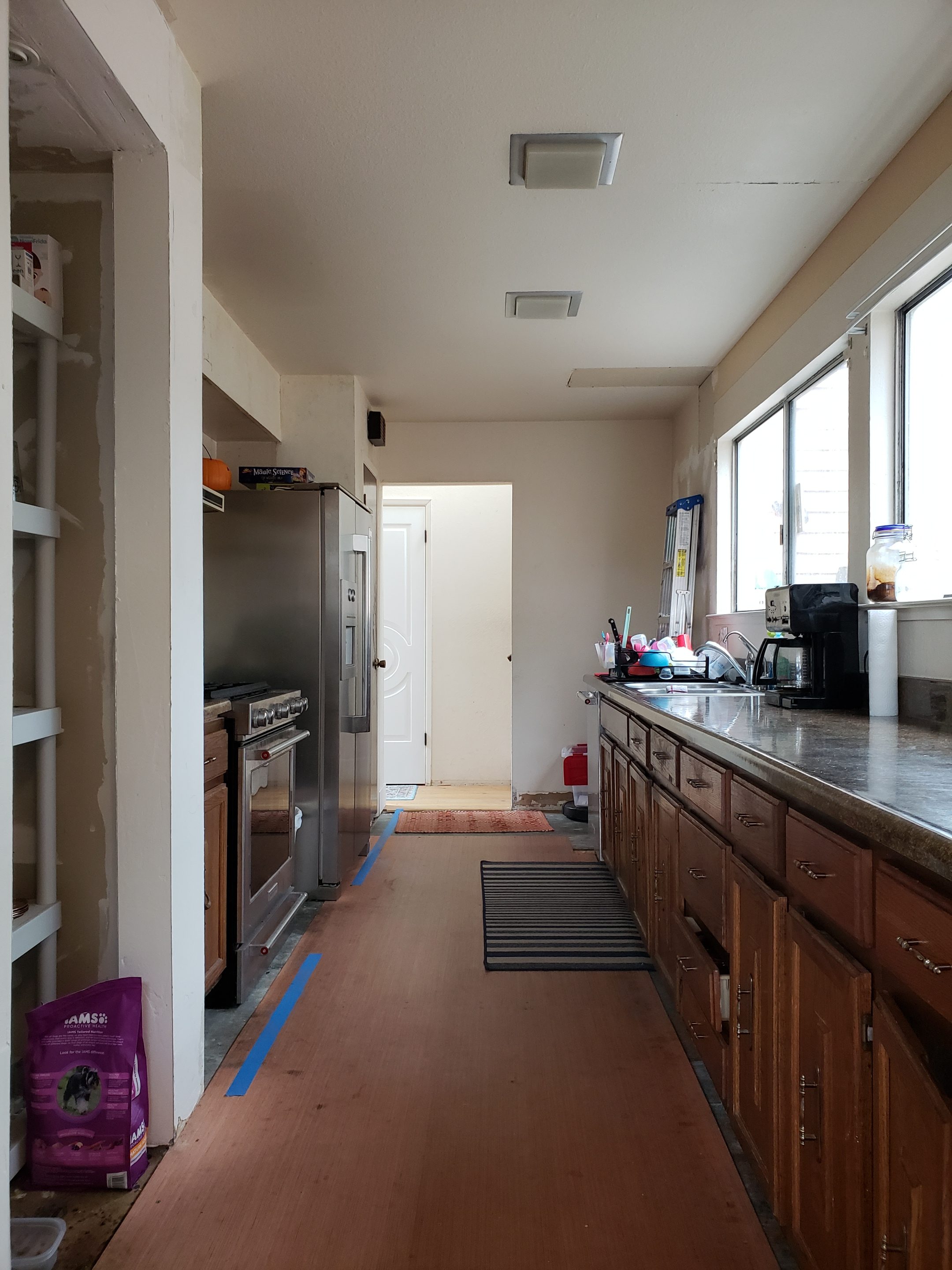
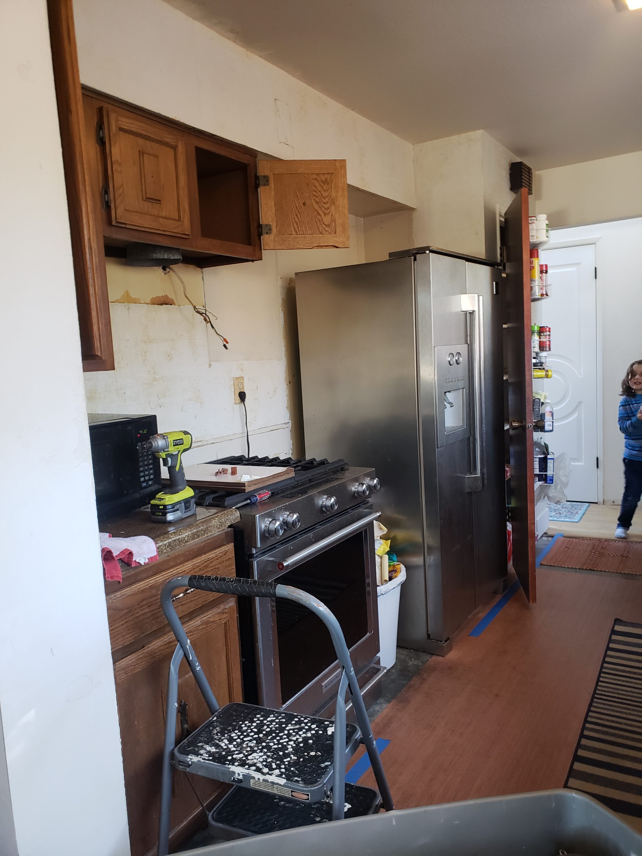
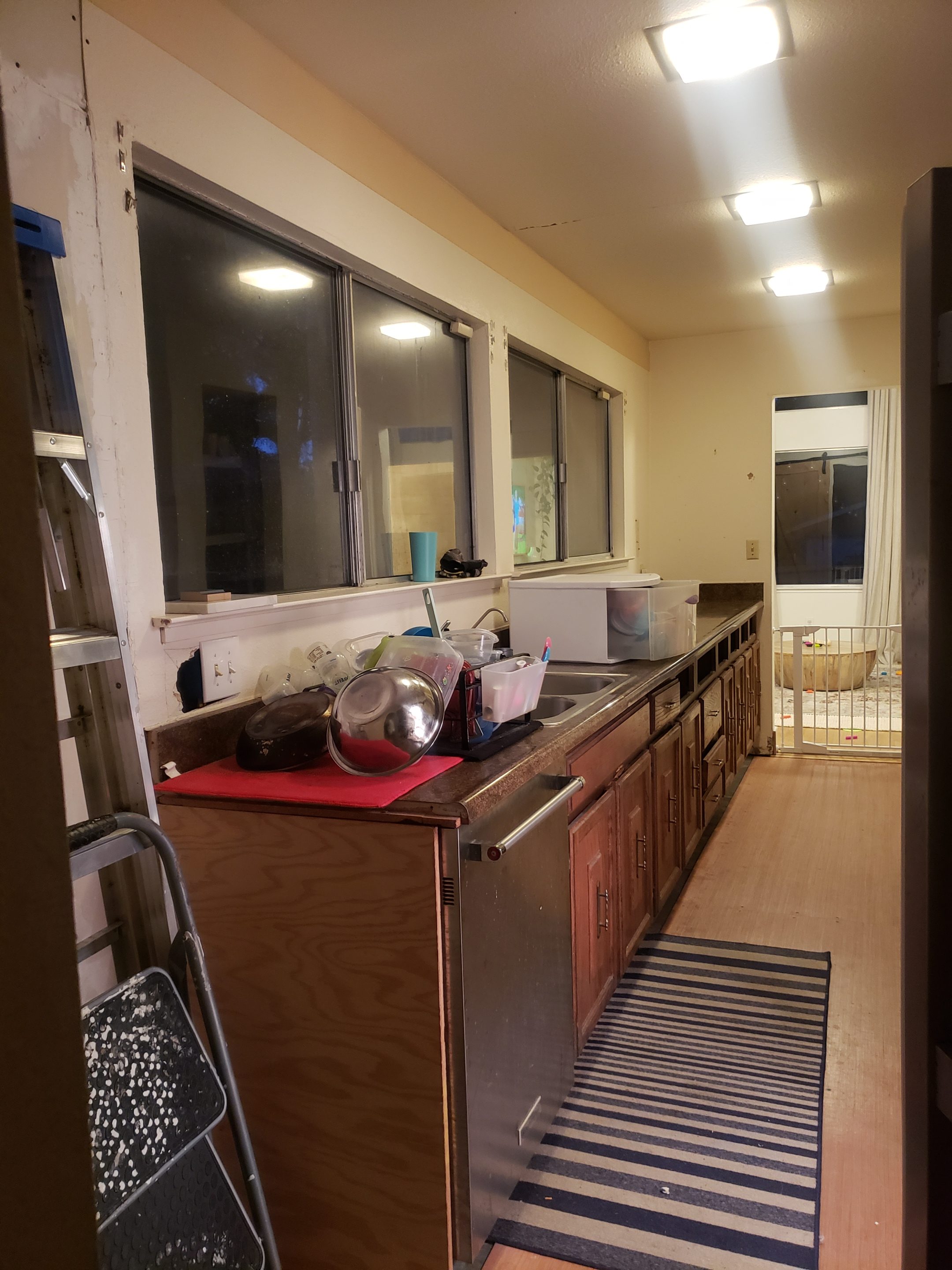
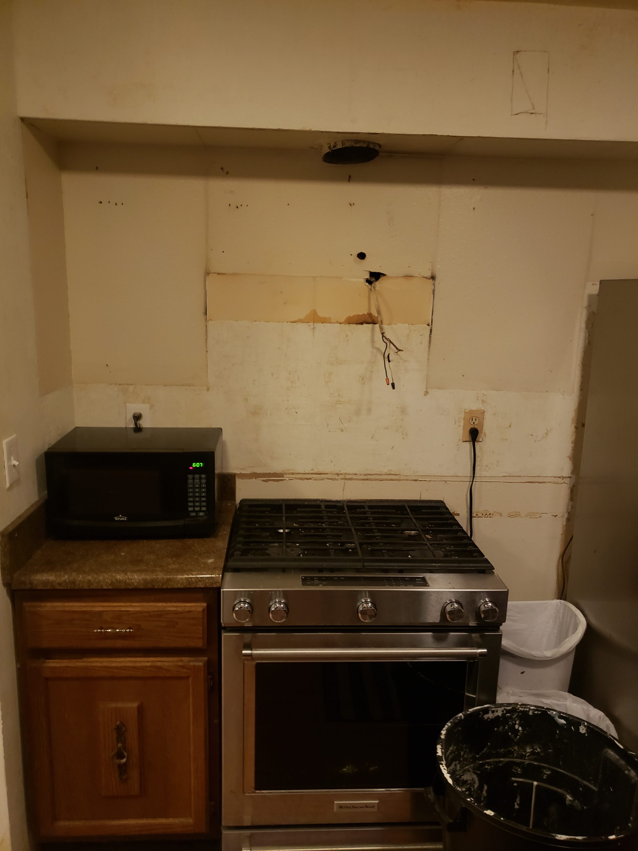

You all doing okay? Throw up in your mouth a little… sorry! That beast was rough-el-stiltskin. Keep in mind we lived, and cooked, in that hideous cave for nearly three years people, yes… three. Okay okay, let us redeem ourselves now with a little after action shall we.

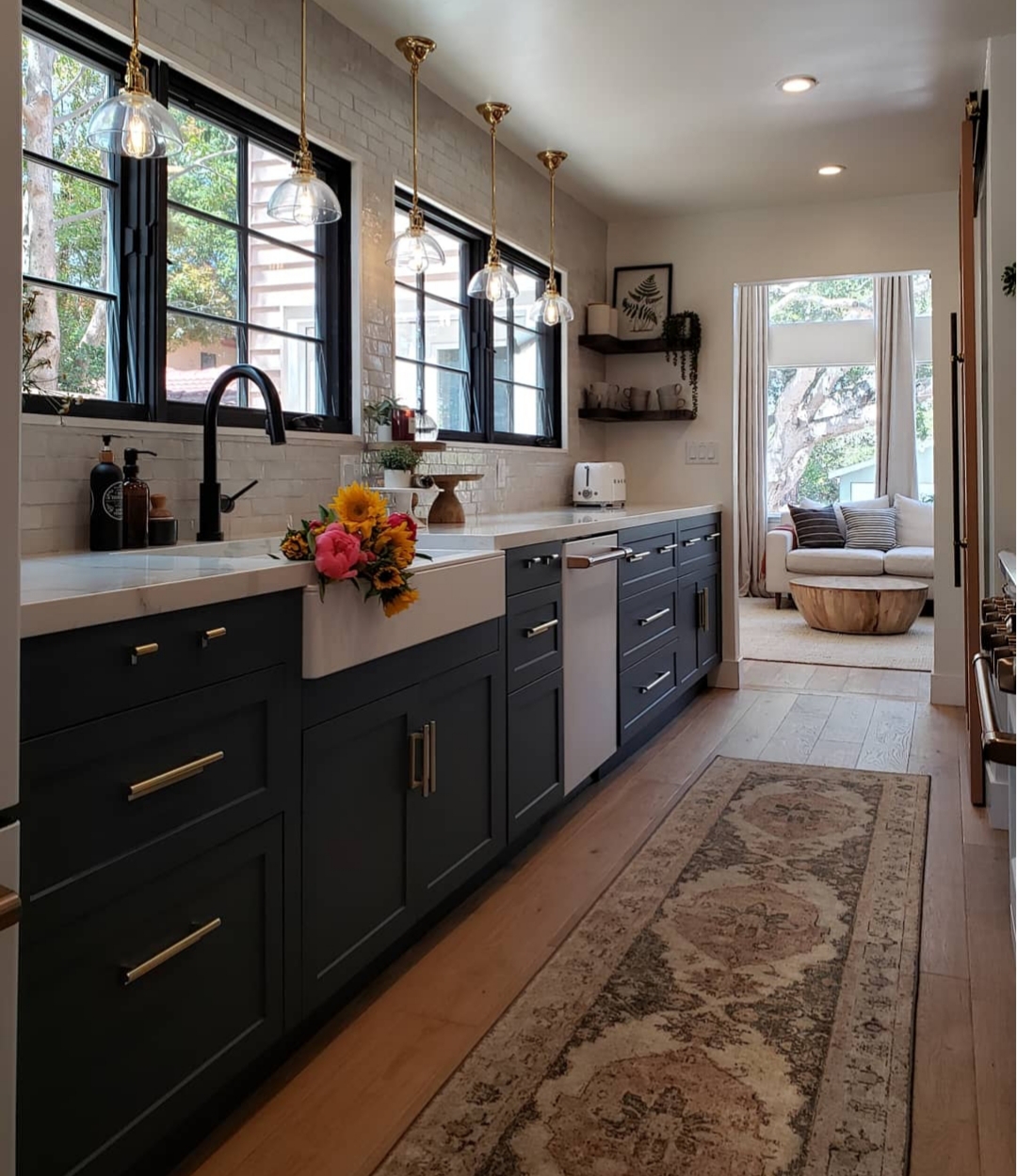
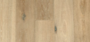
Starting from the ground up. Those floors. They are wide plank, white oak, in the Canewood finish by Garrison Flooring. They have a distressed finished and are absolutely stunning. We have them throughout our entire lower level and are redoing our stairs with them soon as well. We considered tile in the kitchen for 2.5 seconds, but could not get the thought of having these gorgeous Canewood floors, flowing throughout our entire home, out of our heads. They have been in the rest of the home for for 3 years and have held up to our kids, dirt, spills and thrown toys like a champ. They are as perfect as the day installed. This fact made putting them in the kitchen an easy, yes. They are absolutely beautiful and make me smile every day.
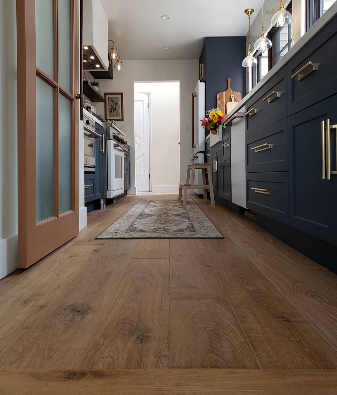
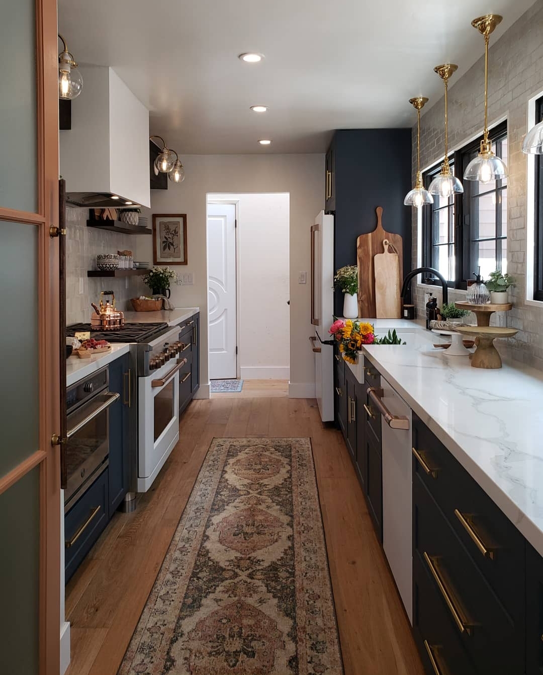
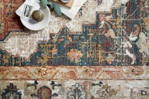
Staying on the ground floor, let’s discuss the runner! This beauty is from the Magnolia line for Loloi and is called the Evie. It is a stunner. The color is rich and the runner is soft underfoot. It is an extra special piece to me because it looks like something my Mom would have had in her home. Also it is named Evie. Evie was my Grandmothers name. I lost both of them, my Mom and Grandma, over the course of this past 18 months so they didn’t get to share this process with me. Having this Loloi runner that reminds me of them everyday is a really special treat.
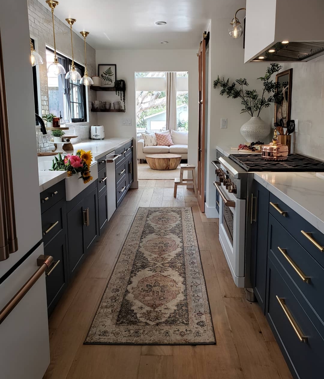
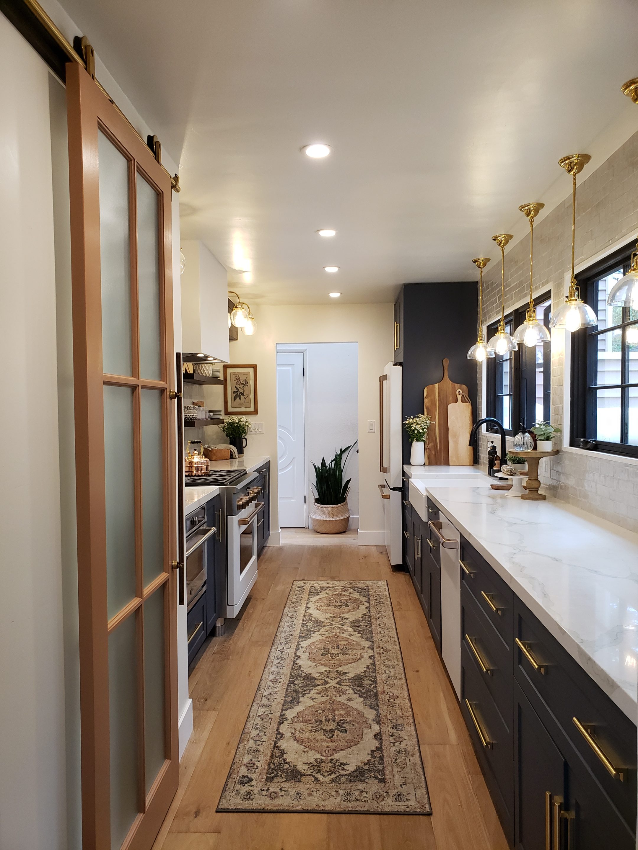
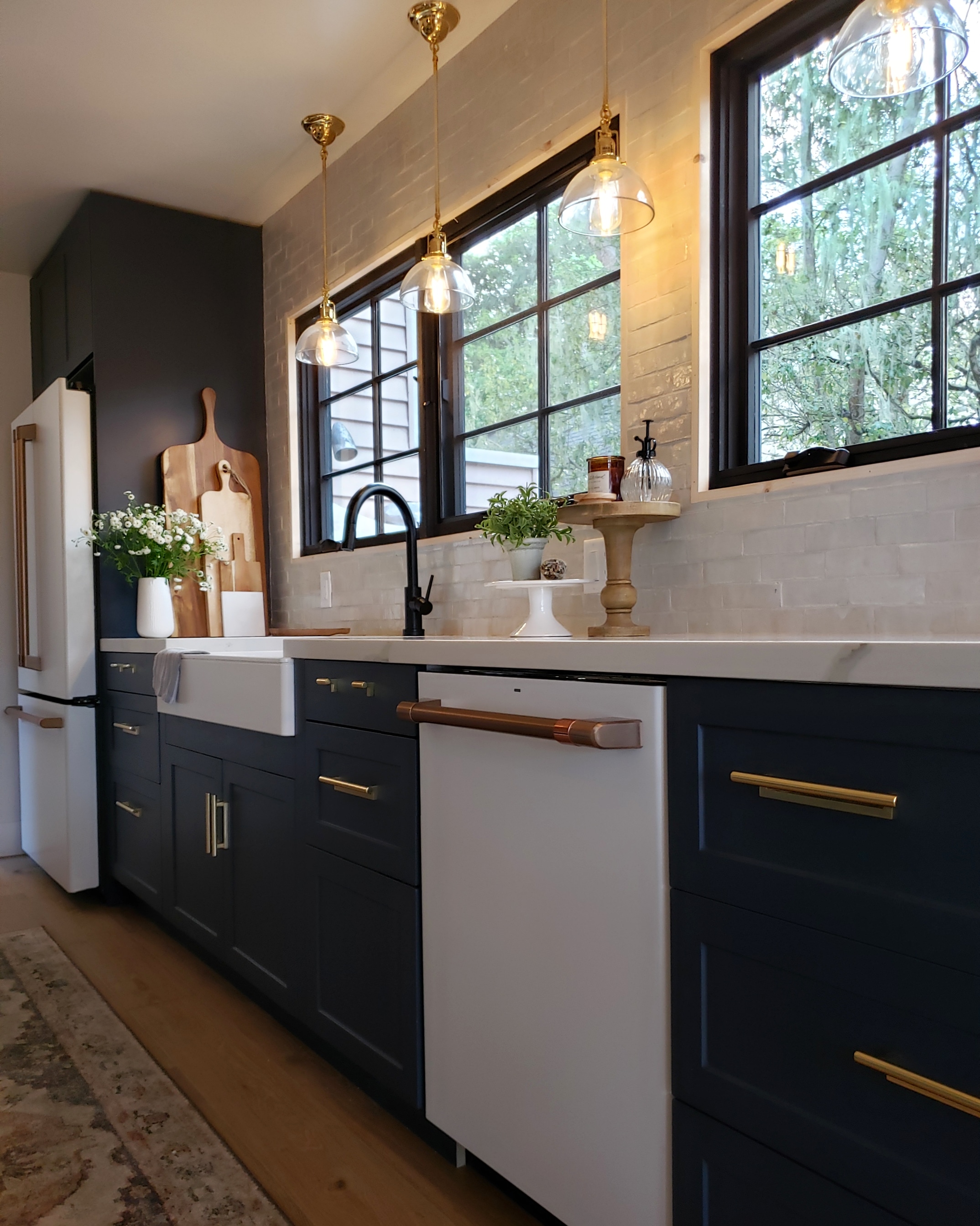
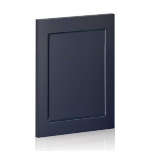
Moving up we find ourselves at the cabinetry. We went with IKEA bases and Semihandmade fronts. Read a full review on that process HERE. We chose the Night Sky Shaker doors from Semihandmade. I wanted a deep and saturated color, and also knew I wanted blue; kind of my signature color. This Night Sky was exactly the touch the room needed and we built the entire design on making this color shine. We absolutely love the quality, color and look of these beautiful doors and absolutely love the functionality and affordability of their counterpart, the IKEA bases. The overall look is so high end without breaking the bank, we love them.
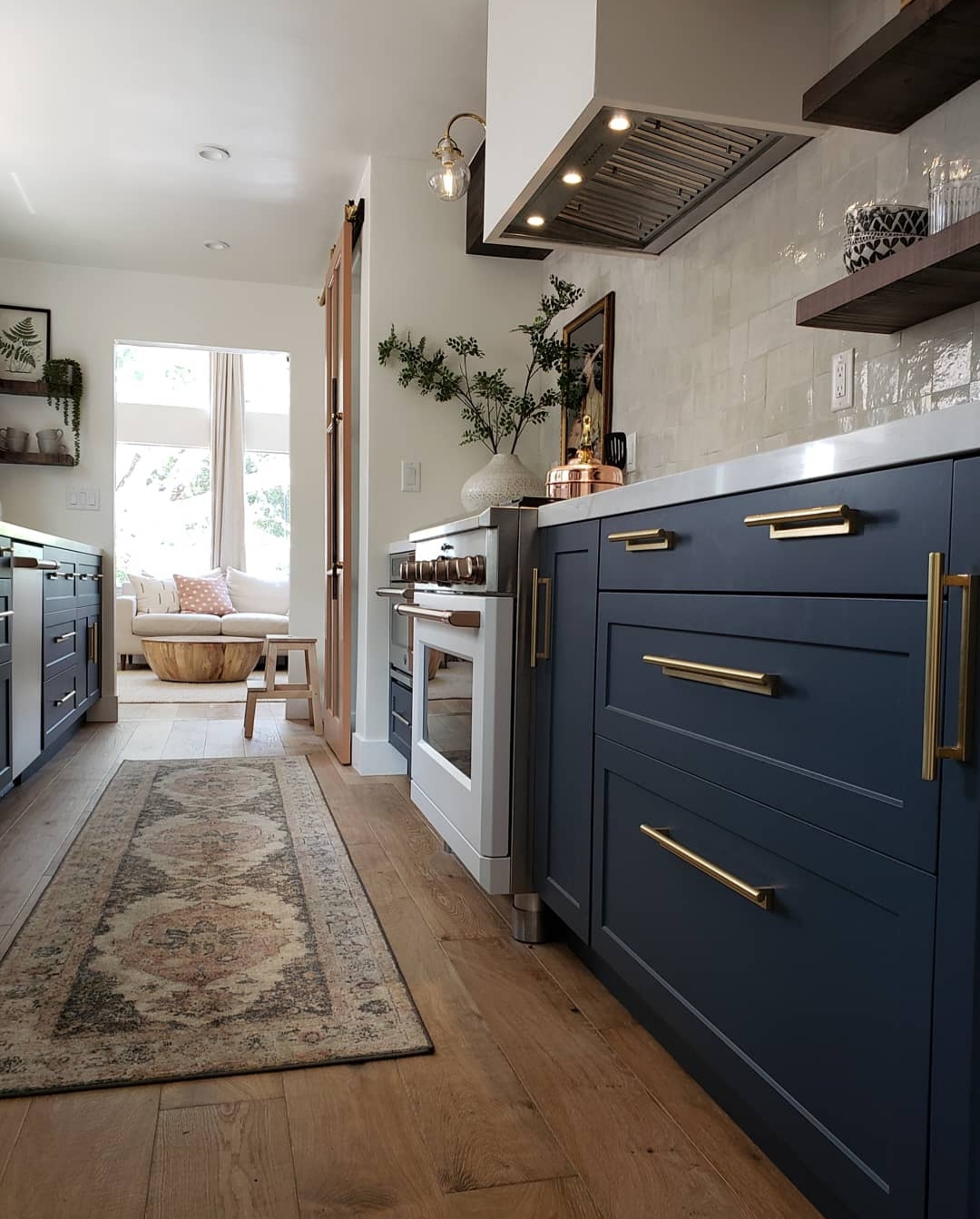
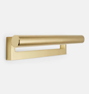
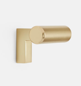
The next stop on our tour is the cabinet hardware. We went with the Upton pull from Rejuvenation. We opted to use them in a few sizes. We used 6 inch pulls paired on the upper drawers and 12 inch pulls on lowers. On the smaller cabinets we used a pair of Upton knobs. We went with the aged brass finish. The color is stunning. It isn’t shiny but absolutely does not look dull and sparkles in the light. It pops off of the cabinetry beautifully. It is truly the jewelry to our cabinets.
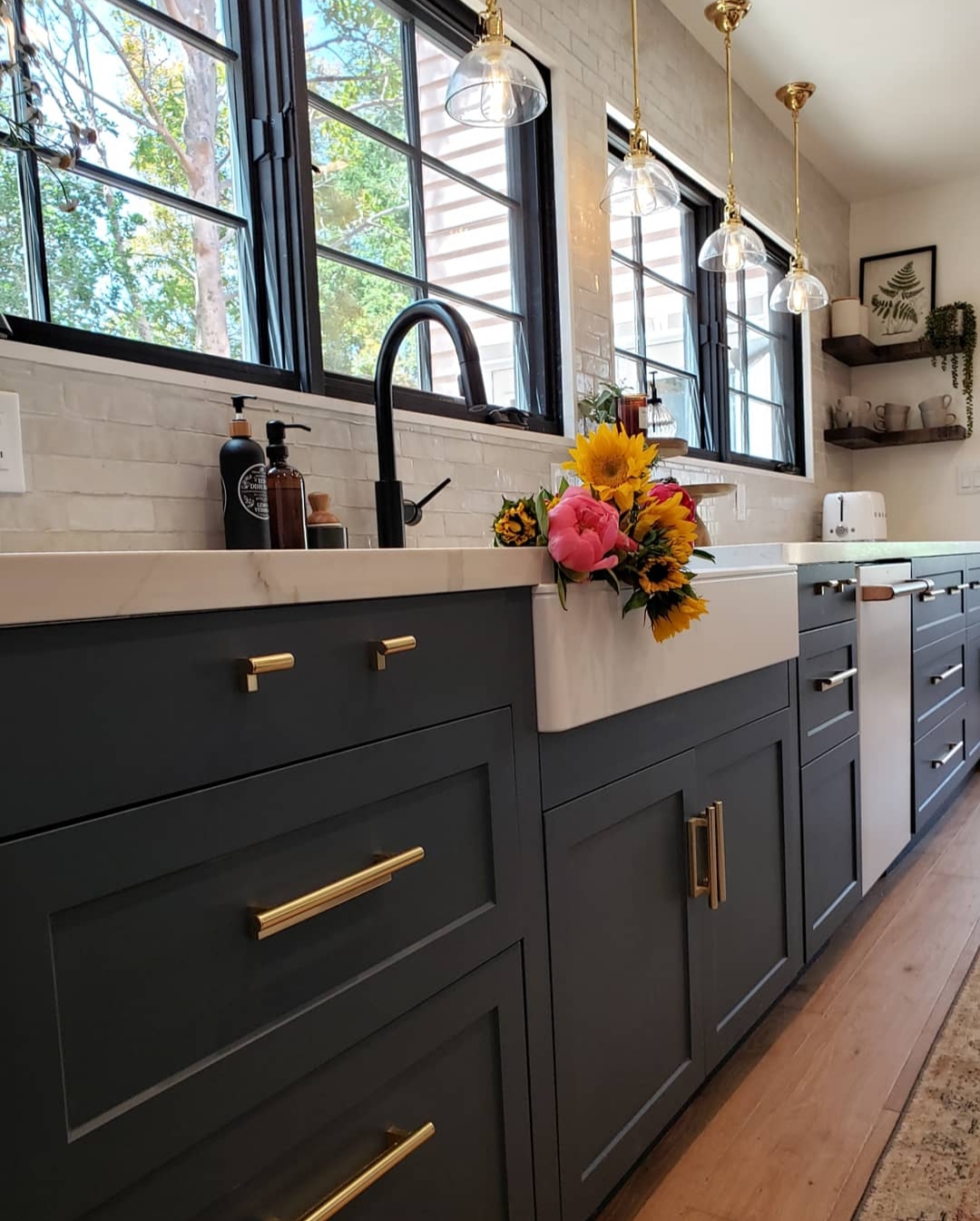
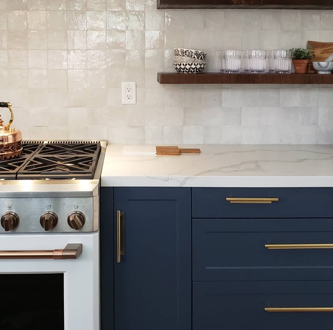
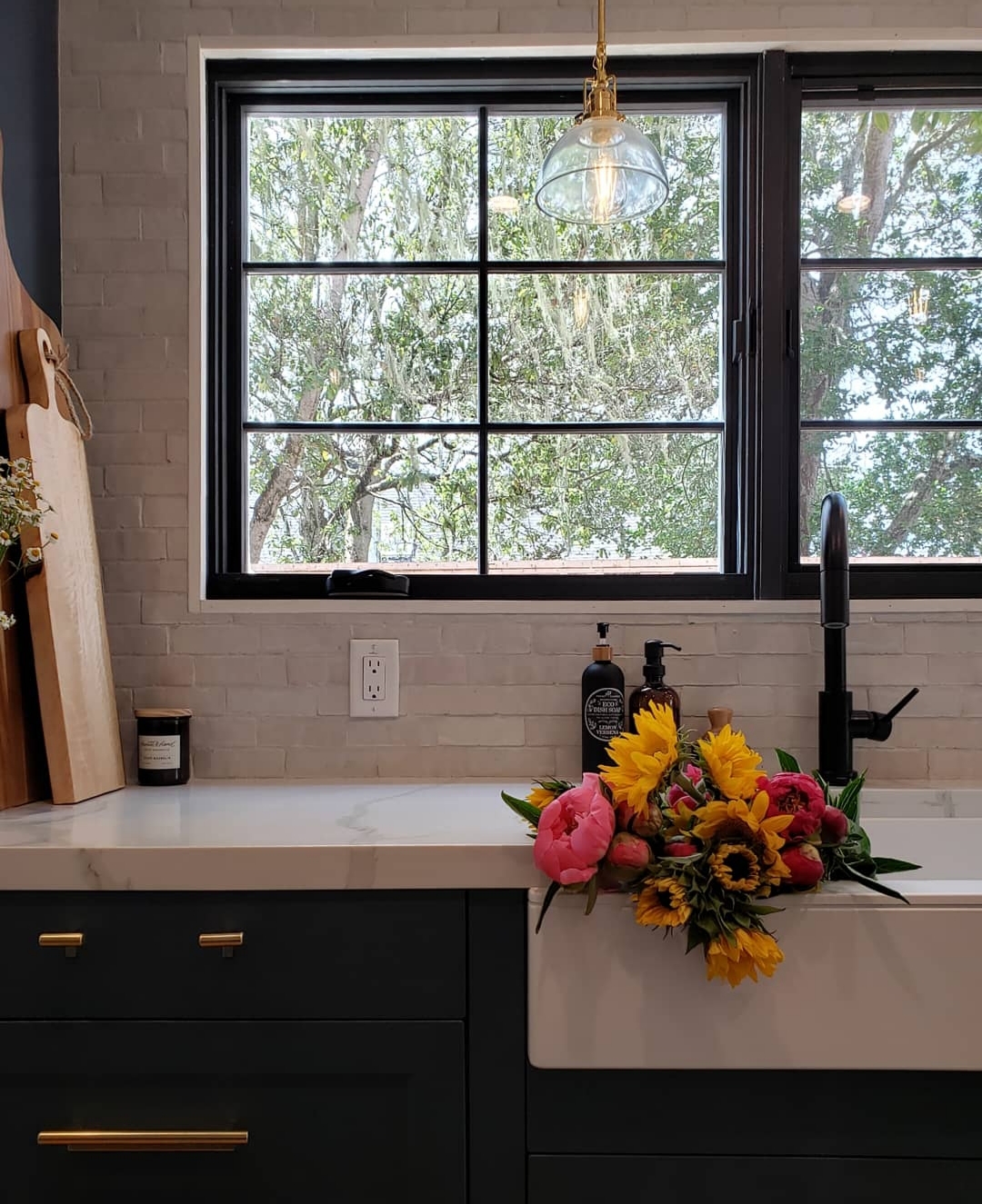
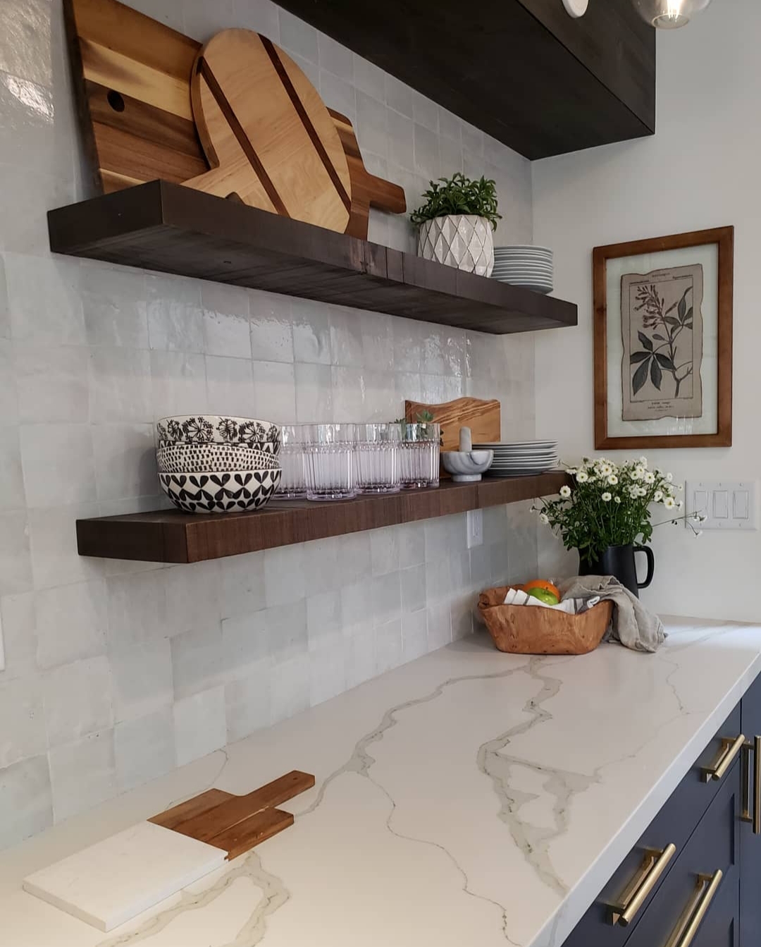
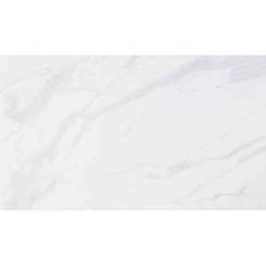
Said cabinetry is topped with our amazing counters. Oh the counters! They are the Callacatta quartz from Bedrosian tile and they are stunning. I mean, I just sit and stare at them sometimes. The veining is think and has tons of movement and tone. There are little flex of golden and taupe that run through the veins and I truly could not love them more. I have known for years I would do a marble look quartz in order to get the look of marble I love, but benefit from the durability of quartz I need. Over the years of window shopping however, I never found a quartz that I truly loved. But this Bedrosian Callacatta quartz has my heart. It is truly something special. We had our fabricator miter the front edge and border of the under-mount sink to achieve the effect that the slabs much more thicker, and the result is spectacular.
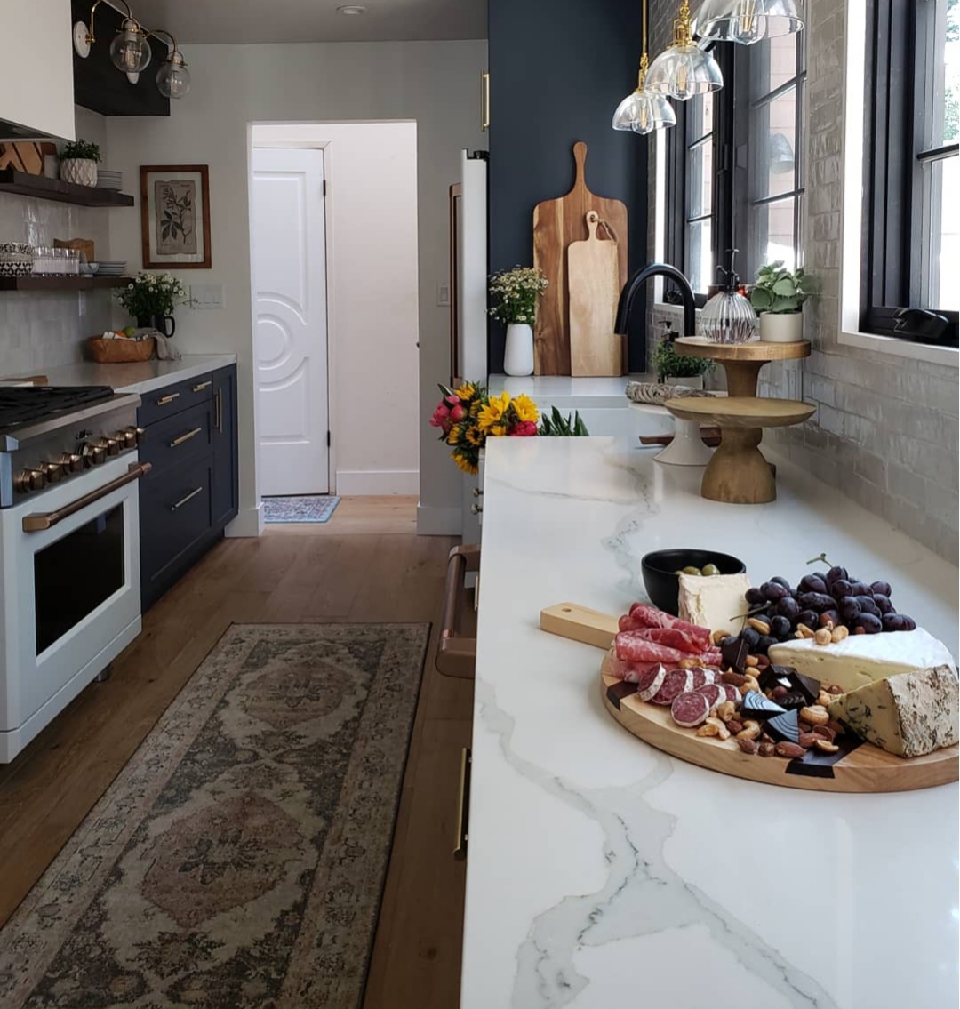
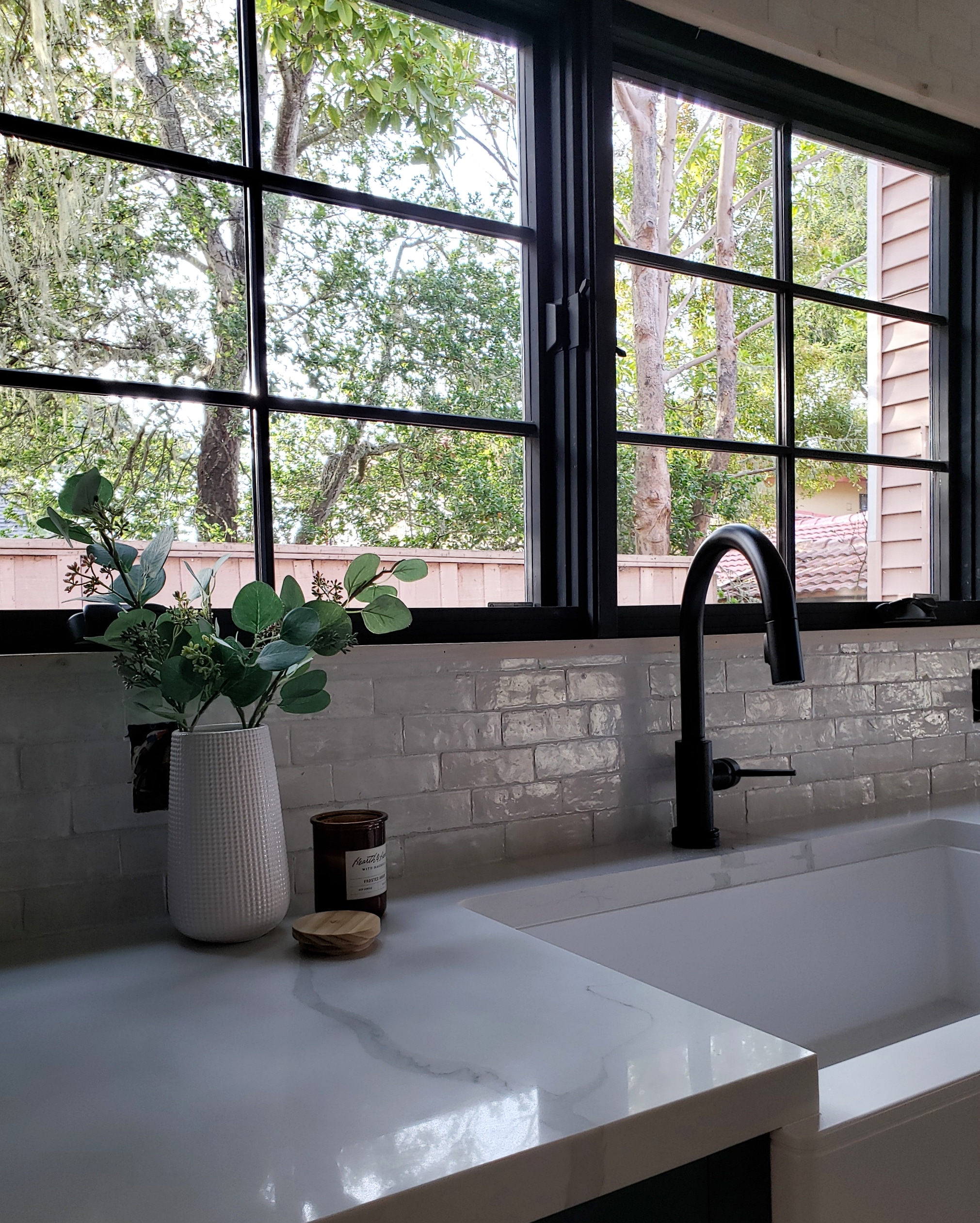
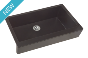
Speaking of the under-mount sink, let’s talk about it. We went with the Elkay Quartz Luxe sink in the ricotta finish. Best decision ever. We wanted a center drain, under-mount, apron-front, matte white, durable, easy to clean and deep sink. It was extremely difficult to find one that ticked all the boxes. Then I found Elkay… BOOM, done. Look no further!! It is truly gorgeous, functional and an incredibly easy to care for sink. We could not be happier. It’s a perfect blend of modern and traditional and ideal option for this space. We paired this beauty with a subtle and lovely matte black faucet.
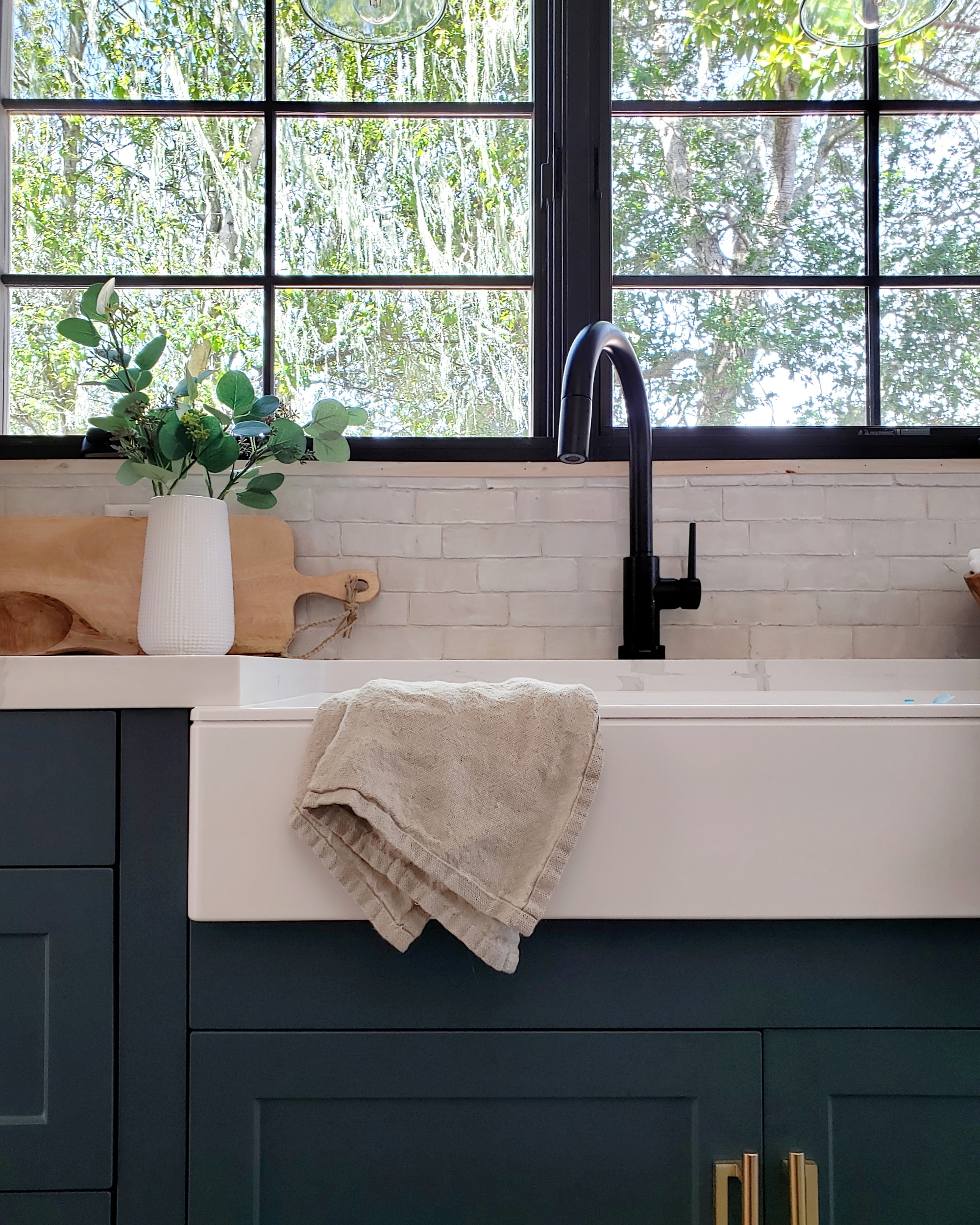
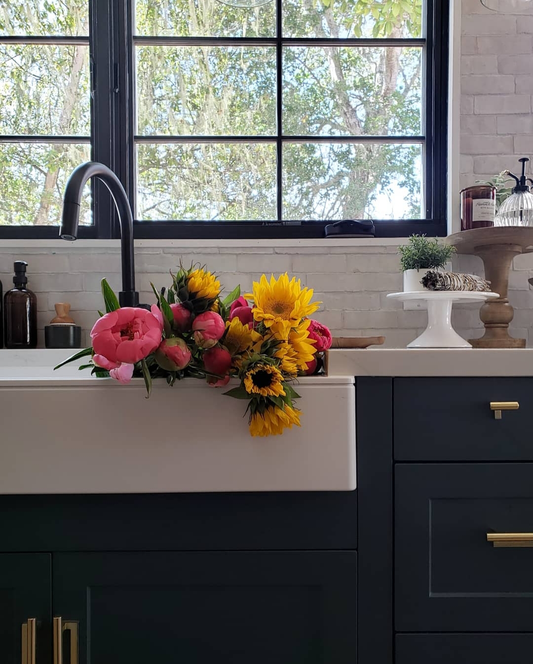
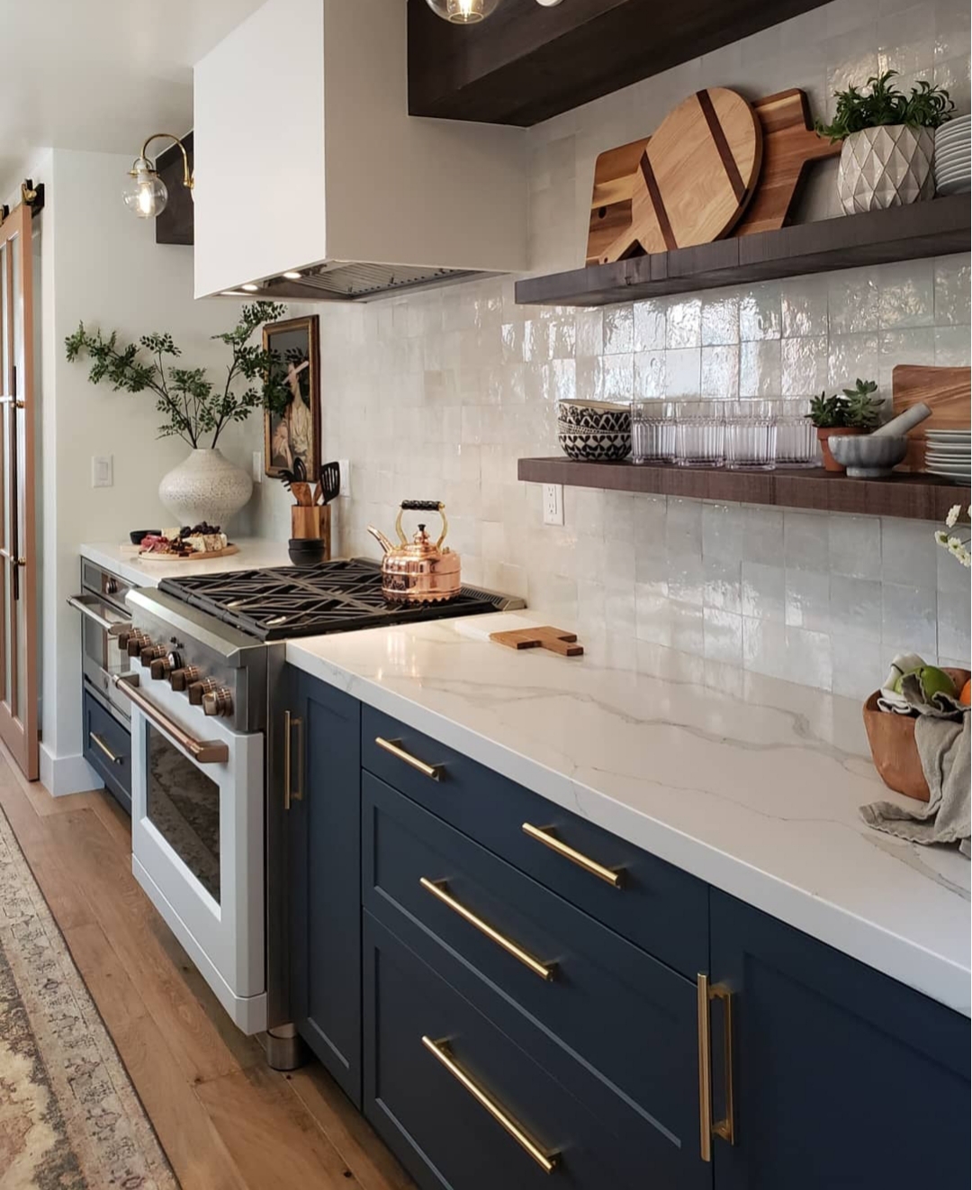
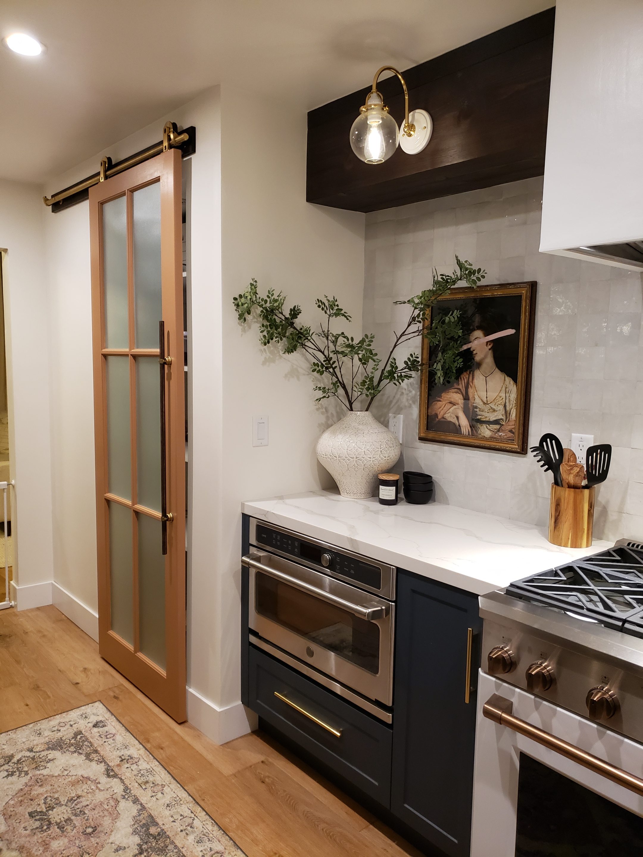
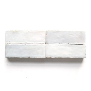
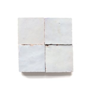
Now for the tile. I swear don’t have enough good things I can say about my depth of love for this Zellige tile from Cle. I mean it’s truly is a showstopper. The sparkle, the texture, the depth of color; every detail is perfection. Which is ironic because the beauty of Zelllige is that it is hand poured, hand cut tile that is filled with imperfections and no two are the same. The beauty is in the flaws; the most delicious kind of imperfect. We opted for the 2×6 subway on one side of the kitchen and the 4×4 square on the other from Cle tile and both are in the weathered white finish with their frost glazed tile grout. I would choose this tile again and again and again. It is breath-taking. Pro Tip: if you aren’t good a tile, hire professionals for this install the imperfections make the install difficult and you want to do the tile justice!

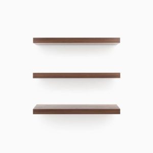
On top of the aforementioned tile we mounted our amazingly functional and insanely durable, strong and sturdy Shelfology floating shelves in their Espresso Rough finish sizes 4 feet by 8 inch deep next to the stove and another set of shelves that are 6 inches deep and 18 inches long for our coffee corner. They have a gorgeous grain and texture and were the perfect dark wood to pair with our soffit that we wrapped in an espresso stain. We mounted the floating shelf brackets prior to tile. We then tiled around the bracket and slid the shelf into place once the tile was complete. Our large shelves are truly impressive and can hold up to 150 pounds. We use them for everyday glassware, plates mugs and cutting boards. They are as functional as they are gorgeous and we have ZERO regrets about using floating shelves instead of uppers. These Shelfology floating shelves are amazing.

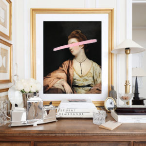
Also finding a home atop the tile is our artwork by the talented, Josh Young. We used his piece titled, Shannon. She is the key to pulling the warm tones and mixed metal together. For me, she is what makes the space feel complete, and special. I am honored to have Josh’s work in our kitchen.

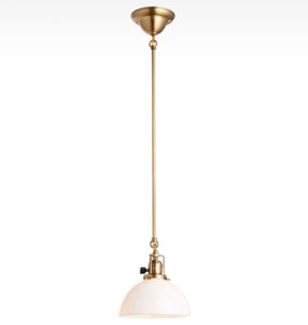
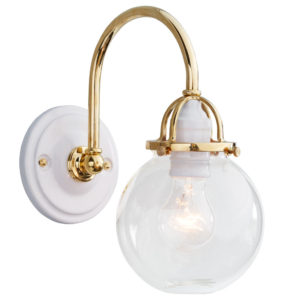
Highlighting Shannon at night is one of our gorgeous sconces which brings me to the lighting we selected. We headed back to Rejuvenation for this one. We went with the 3 of their Mist Arched sconce as well as 5 of their Ford Mills 2 1/4 fitter pendants. I honestly didn’t even consider another light source after I saw what Rejuvenation had to offer. We opted for sconce lighting on one side of the space and pendants on the other to set them apart. Both finished in lacquered polished brass with clear glass domes and shades. They are the most stunning fixtures in the evening, with the dimmers set, the glow is breathtaking. The way the brass bounces the light is beyond, and I am madly in love with the way they have completely transformed the space. They are showpieces. The craftsmanship is also truly impressive.


Those pendants I just mentioned hang in front of our big beautiful new black frame windows. These lovelies are from Sierra Pacific Windows and they made a world of difference to the room. Modern meets traditional and they’re perfect.
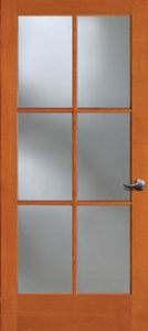
Next is the pantry. We removed one of the two pantries and were able to do this because we upgraded to MUCH more functional and super deep cabinets. The new pantry is our food pantry, so we needed a door that would hide the mess but not solid. If it was solid it wouldn’t overwhelm the space or even shrink it by feeling too heavy on one side. I was having a heck of a time finding the right door. The proportions we needed were very atypical. Then I found Simpson Door Company and they let you chose custom door measurements and glass… perfection! We were able to chose a door to fit the very narrow space. We picked an interior French door which is a standard door that can be used as a traditional door. We however opted to combine it with barn door hardware and make it a slider. Simpson sent us loads of glass samples so we could make sure we got the just right coverage to keep our pantry goods hidden but allowed light to flow through. It is perfect. We painted it out with Cider Spice by Behr and paired it with a custom ledger board and dowel handle, both stained to match the soffit, as well as brass slider and door hardware. The result is a completely custom and one of a kind pantry door and it could not have happened without Simpson Door Company.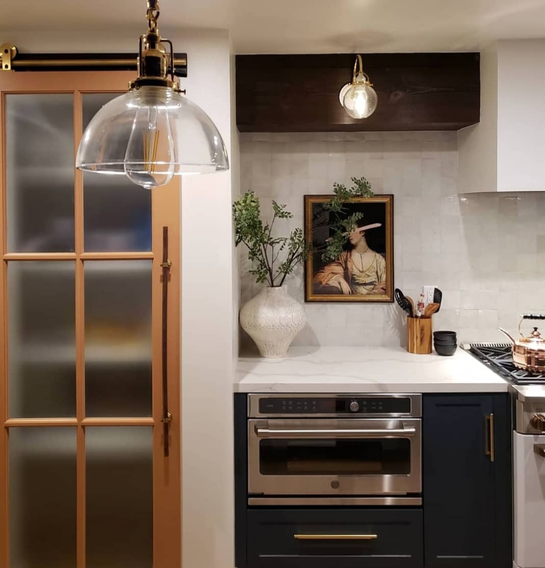
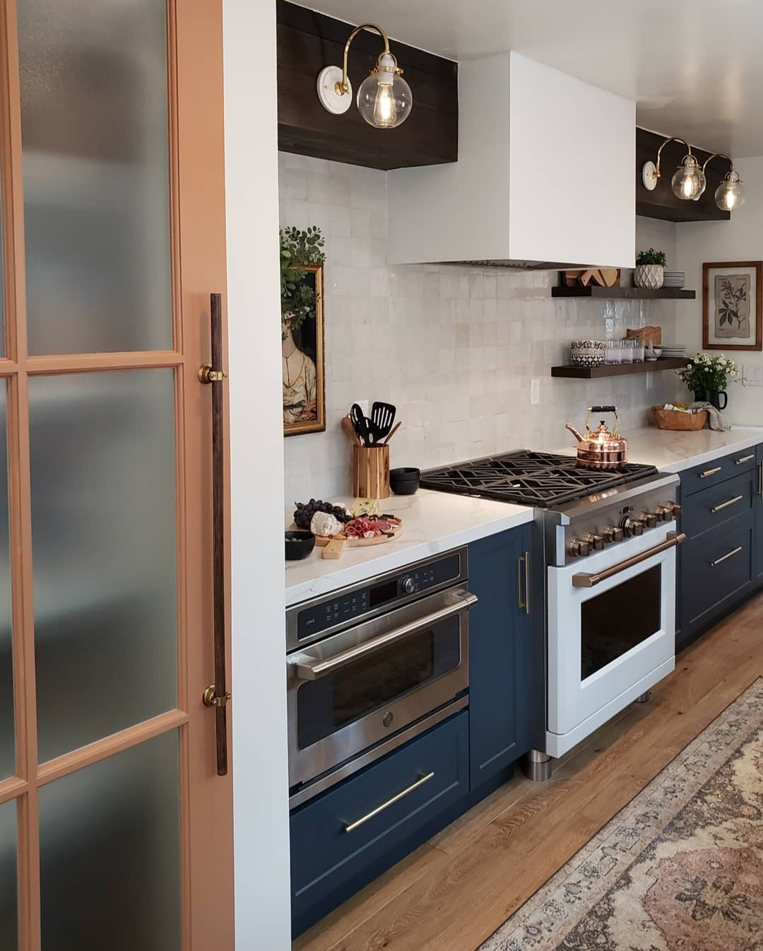
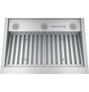
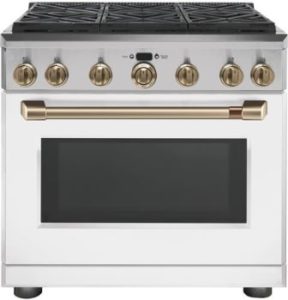
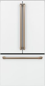
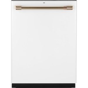
Last but not least, the piece de resistance, the Cafe Appliances. I mean… you guys, let’s be real, they make the kitchen. They are the appliances dreams are made of. Beyond being stunning they’re extremely well made and function beautifully. I cannot get over the range especially. Six burners is a game changer. They are without question the first thing anyone comments on when coming into the space. We opted for the matte white finish with the brushed bronze pulls, which reads more like rose gold in person, and they’re EVERYTHING. We got a full suite with the refrigerator, dishwasher, range and hood insert and are obsessed with all of it. Cafe single handedly brought white appliance back into fashion IMHO and they knocked it out of the park. These appliances took the kitchen remodel to another level and I needed the rest of the design to rise to the occasion. I hope we did them proud.
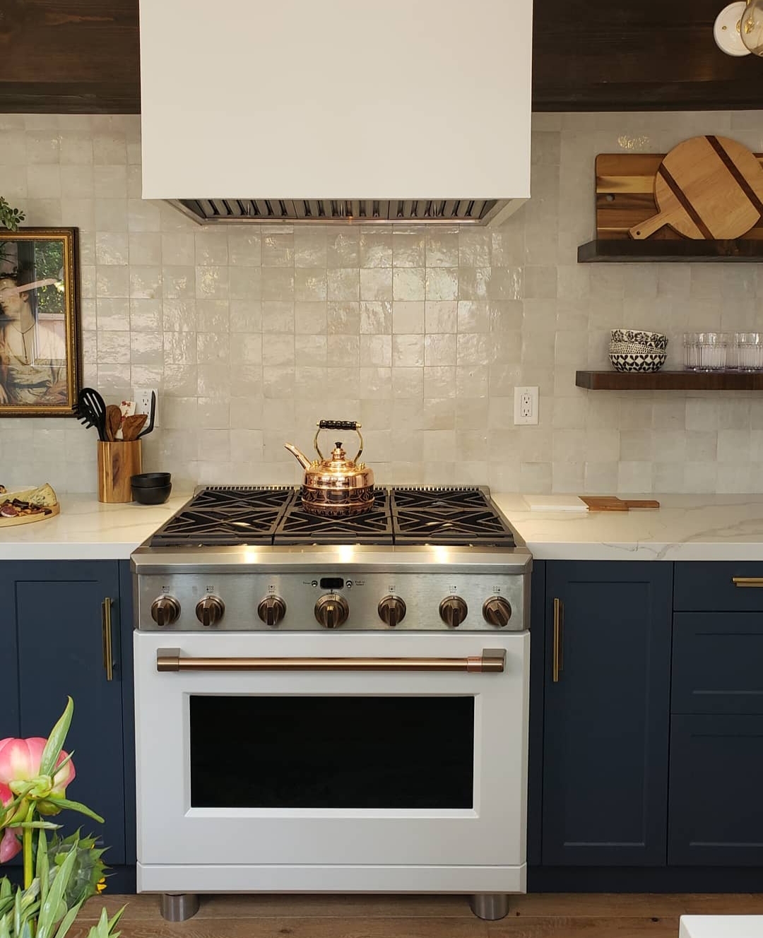

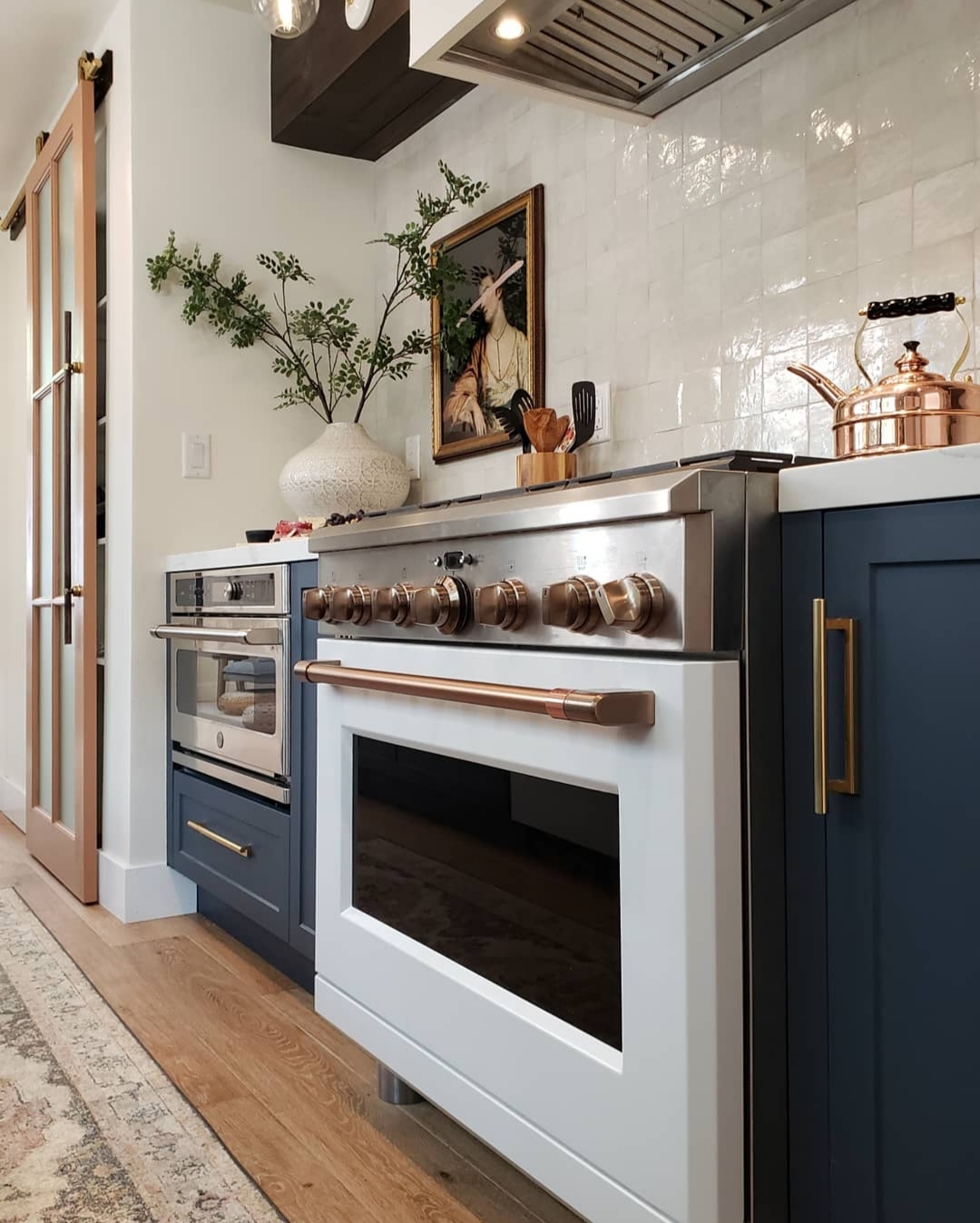
For fun here are some more shots just because we love the finished space so much!

SHOP THE POST
European White Oak in Canewood
Night Sky Super Matte Shaker Doors
Evie Runner by Magnolia for Loloi
Door Style 1506, Glass: Mist Lite, Primed (we painted Cedar Spice by Behr)
Askel Floating Shelf System in espresso rough
Matte White 6 Burner Dual Fuel Professional Range
Matte White 23.1 cubic foot counter depth Refrigerator
Matte White built in Dishwasher with hidden controls
WiFi LED 36″ Custom Hood Insert
